Table of contents
Want a design review like this for your startup?
10 Design Trend in AI Websites
20 min
Studio Salt
After looking at 100+ AI websites

After looking at 100+ AI websites and analyzing their brand & websites, we have noticed some trends and patterns in the website design style. Just to share the following 10 as a sneak peek.
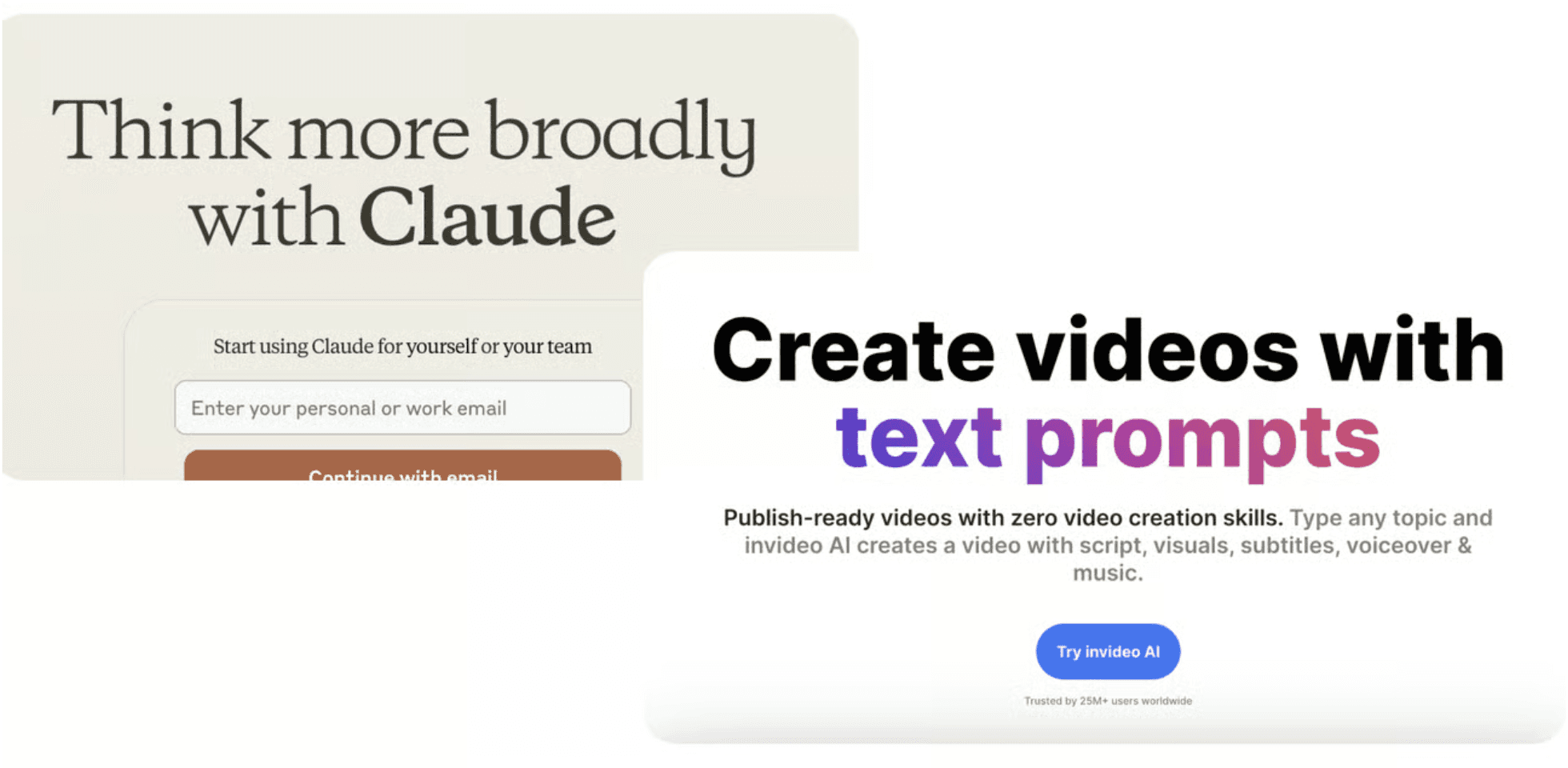
Light Mode Dominates Over Dark Mode
60% AI websites we studied use light mode, 23% uses dark mode, and the rest 17% uses a mix of light and dark. This means the background is white or light-colored and it makes the text easy to read. Light mode is often seen as clean and professional. It helps make the website feel open and friendly. Also, it is easier for people to read in bright environments.

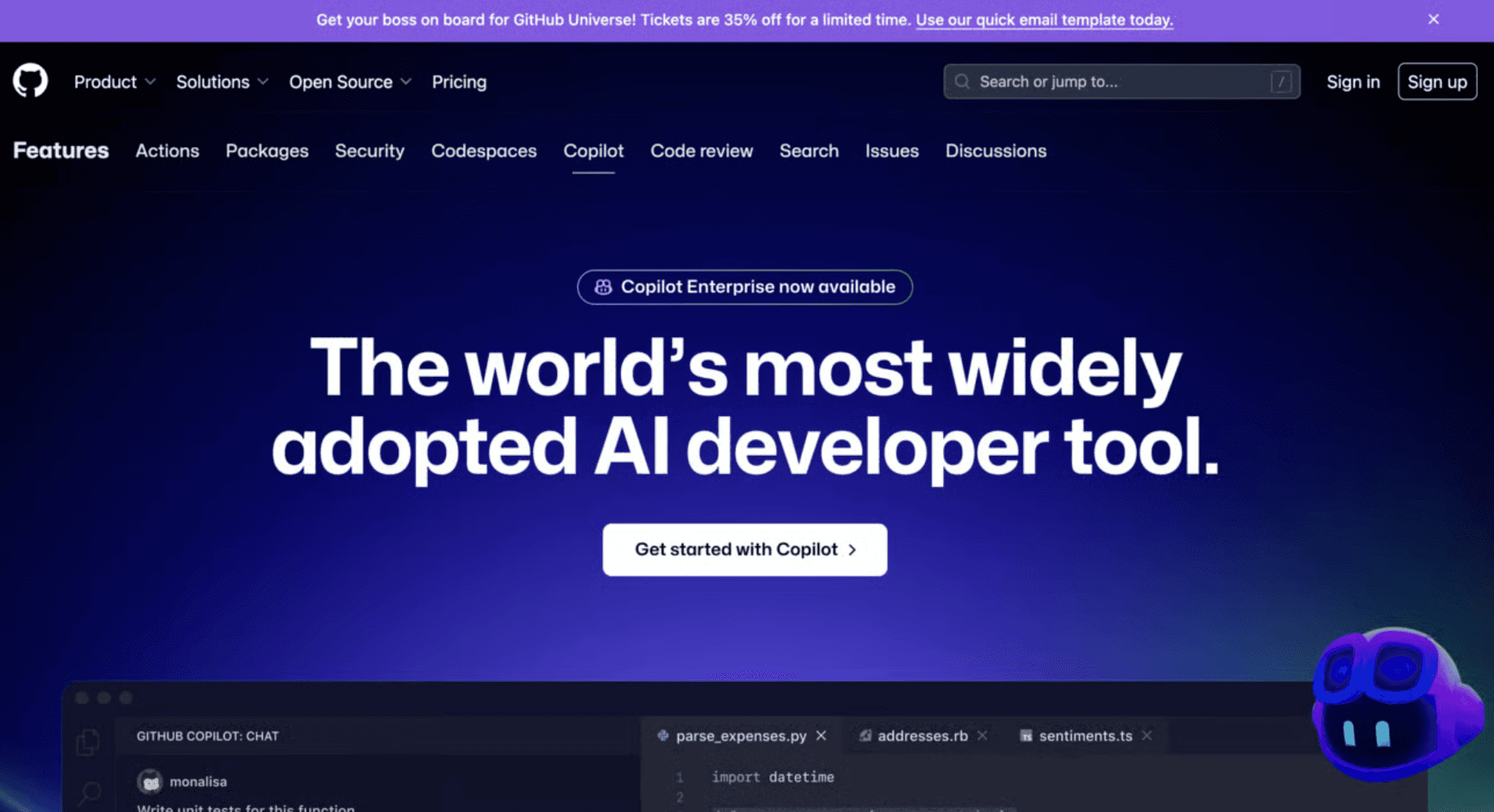
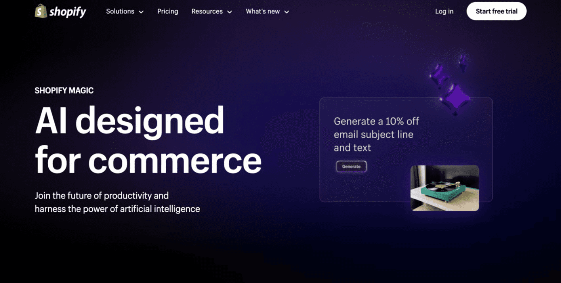
Purple is the Go-To Color for AI Brands
Many AI websites use purple. Following that is blue and green. Different from SaaS or Fintech where blue is dominating the brand, purple seems to be the favorite color for AI brands as it looks cool and techy. Purple is associated with creativity, wisdom, and technology. It stands out and gives a magical and futuristic feel, which is perfect for AI products. Purple also combines the calmness of blue and the energy of red, making it an attractive choice.
When big brands like Shopify and GitHub launch their AI features, they also use purple as the main product brand color. It's clear that purple is a favorite among AI founders.
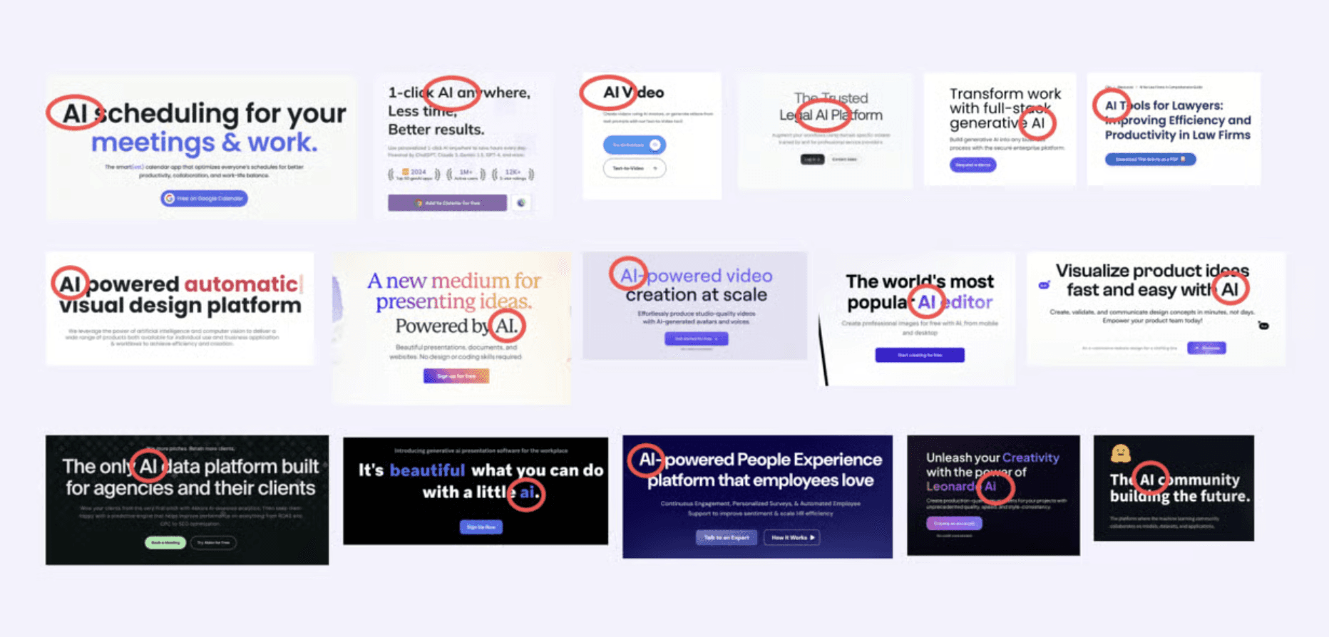
"AI" Headlines Are the New Standard
More websites use "AI" in their headlines. This makes it clear that they are leveraging artificial intelligence in someway in their product experience. It catches visitors eye quickly. It makes the site easy to find through search engines and helps attract people interested in technology and innovation. As AI is widely accepted by everyday consumers, using "AI" in the headline might help with conversion and monetizations too.
Dynamic Headlines Highlight AI Versatility
Some AI websites have moving words in their headlines. These moving words show different things the AI can do. It looks fun and shows lots of features. Moving keywords can grab attention and keep visitors engaged. They also help to quickly communicate the various functions and benefits of the AI product, making it easier for visitors to understand what the product can do.
Cannot decide one headline to describe your product? Use dynamic headlines to show your versatility.

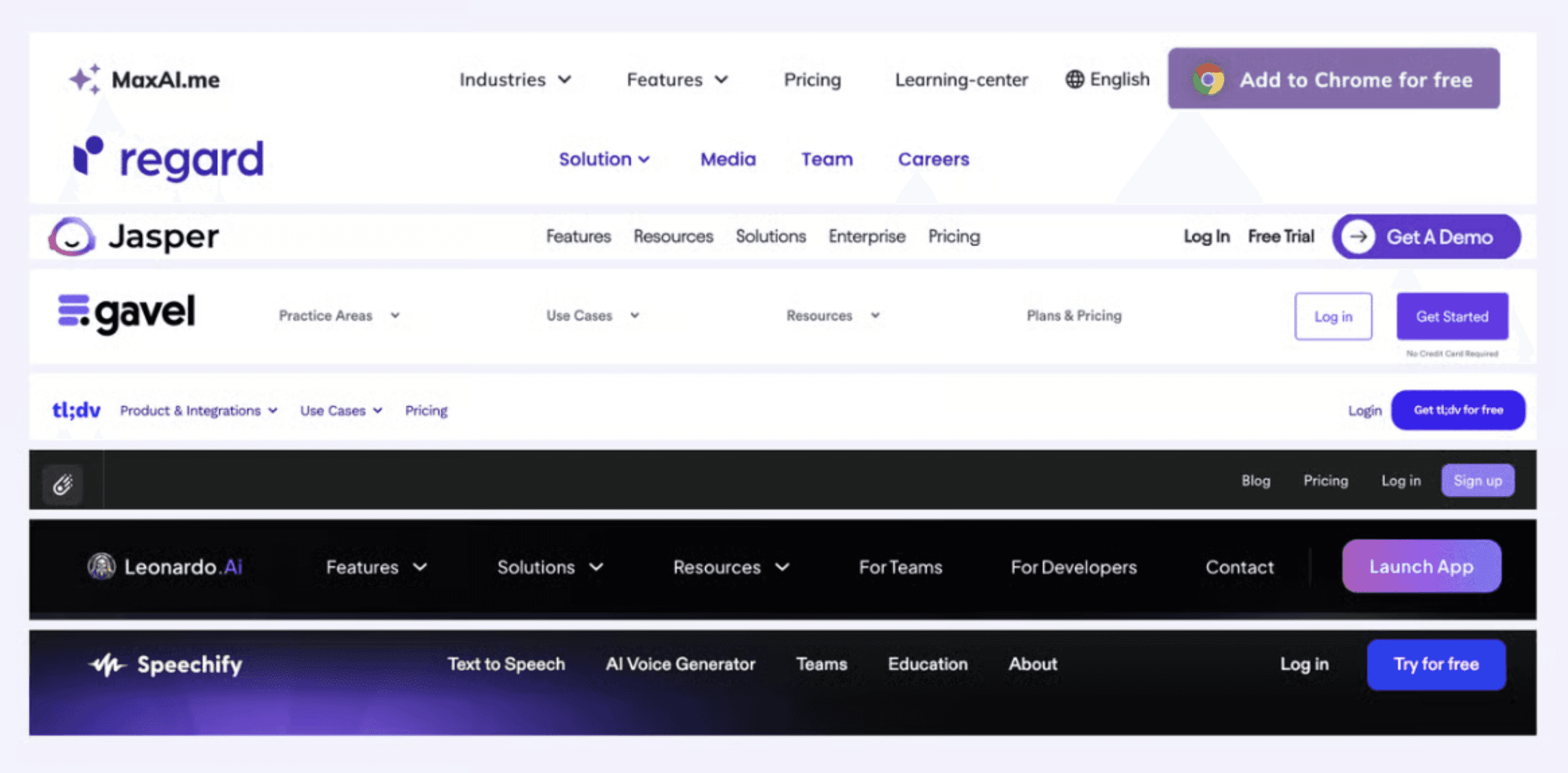
Sans Serif Fonts Dominate Headlines
Most AI websites (80%+) use sans serif fonts in their headlines. It’s still true for most website headline fonts. San Serif fonts are simple and legible. They are easier to read on screens, especially in different sizes. This helps make the website look sleek and professional, which is important for tech companies.
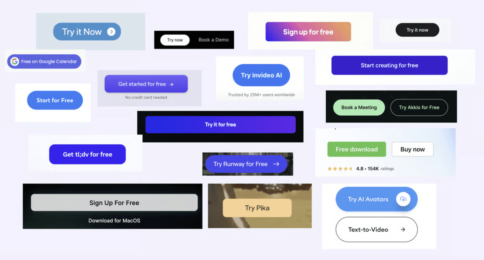
While "Try Free" is the main Call-to-Action, some AI products go straight to the experience
Most AI websites use "Try Free" as their main call-to-action (CTA). This invites visitors to test the product and get the “aha” moment without paying. Offering a free trial helps attract users who want to see if the product meets their needs before buying. It lowers the barrier to entry and builds trust. However, some websites even let users start using the product right away, without any intro or signup, which makes it even easier to try.
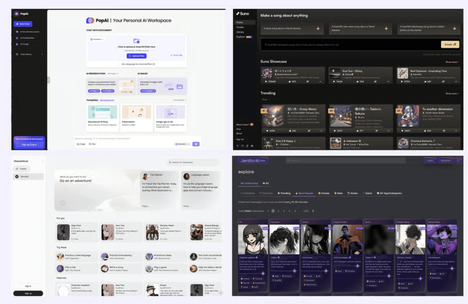
"Bento Box" Layouts are Popular for Showcasing Features
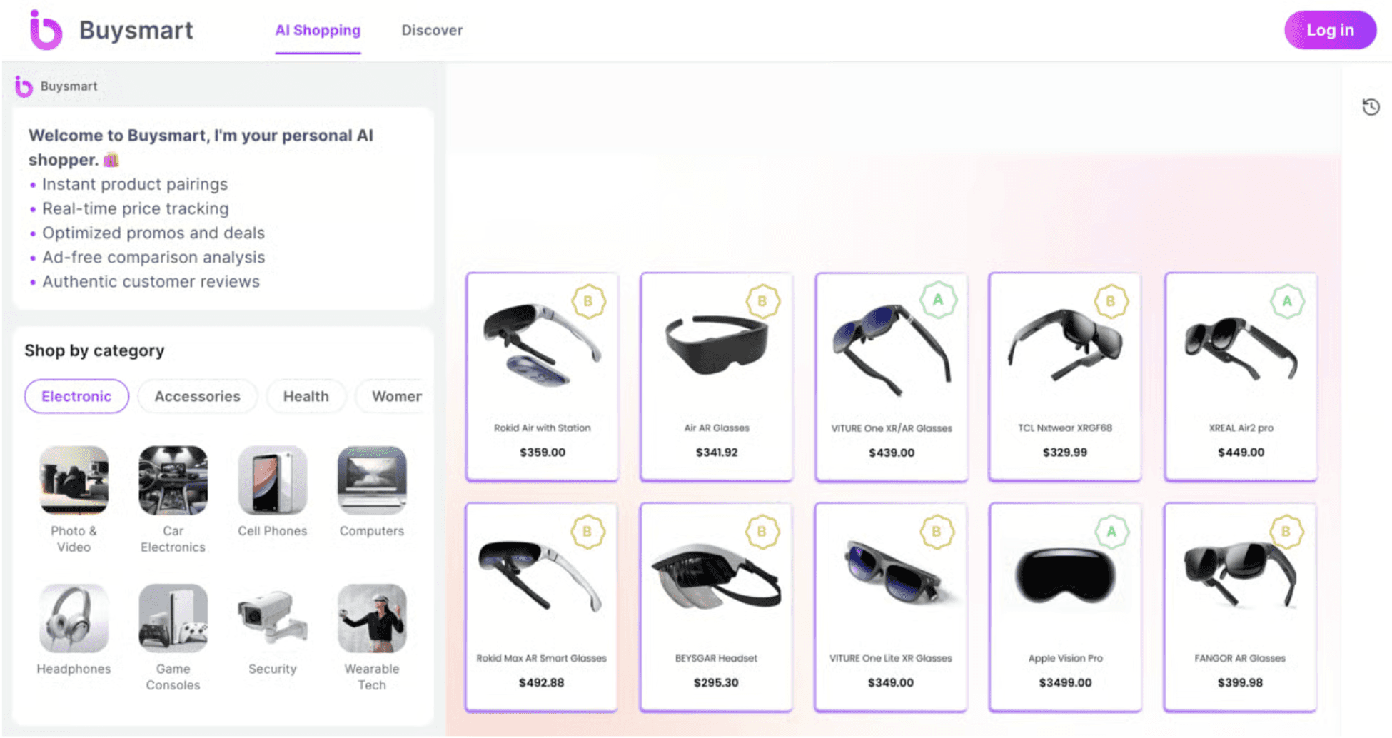
Many AI websites use a "bento box" layout to show features. This means they use small, square or rectangular sections to organize information. A bento box layout is neat and tidy. It helps visitors see all the features at a glance. Each section can highlight a different function, making it easier for users to understand what the product offers. It also looks modern and visually appealing.
Consistent Feature Layouts are the New Norm
Previously website often use alternative layouts to make sure similar layout doesn’t appear too boring. Now, I have seen AI websites use a consistent layout for showing features. This means each feature is presented in the same way. Consistency helps users navigate the site more easily. When each feature looks similar, visitors know where to look and how to find information. This makes the website feel more organized and professional.

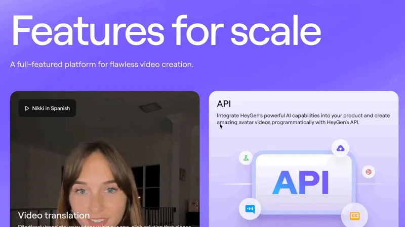
GIFs and Animations Enhance User Understanding
Many AI websites use GIFs and animations to explain their products. These moving images show how the product works. GIFs and animations can quickly show complex ideas in a fun and engaging way. They help create "aha" moments where visitors understand the product better. Moving images grab attention and can make the website more interactive and lively.

Creativity in Web Design is Still Thriving
Even with these trends, there is still plenty of room for creativity in web design. While many websites still look pretty similar to old sites, some AI websites are finding new and unique ways to stand out. Creativity helps websites be memorable and unique. It allows brands to express their personality and connect with their audience.
As AI becomes a new norm for everyone, I bet the website experience will also evolve drastically in the next 3-5 years. Many e-commerce websites are already heading in a different direction, leveraging AI's accuracy to better address consumers’ searching needs.
Final Thoughts
Similar to the advice we give to many founders: if you want to leverage a trend, follow it; if you want to stand out, try something different. This principle is especially relevant as technology continues to evolve at a rapid pace.
Given the constant advancements in technology, we strongly suggest that founders and designers not only embrace new trends and techniques but also think creatively about how they can push the boundaries.
Key Takeaways
AI websites increasingly use bold visual identities to stand out in a crowded landscape.
Dynamic gradients and depth create energy and emphasize modernity without compromising readability.
Minimal, developer-friendly interfaces balance technical credibility with clean presentation.
Interactive elements and micro-animations improve engagement and signal responsiveness.
Visual storytelling paired with clear hierarchy helps users understand complex AI value quickly.
Let’s work together!
Table of contents
Want a design review like this for your startup?
10 Design Trend in AI Websites
20 min
Studio Salt
After looking at 100+ AI websites
After looking at 100+ AI websites and analyzing their brand & websites, we have noticed some trends and patterns in the website design style. Just to share the following 10 as a sneak peek.
Light Mode Dominates Over Dark Mode
60% AI websites we studied use light mode, 23% uses dark mode, and the rest 17% uses a mix of light and dark. This means the background is white or light-colored and it makes the text easy to read. Light mode is often seen as clean and professional. It helps make the website feel open and friendly. Also, it is easier for people to read in bright environments.
Purple is the Go-To Color for AI Brands
Many AI websites use purple. Following that is blue and green. Different from SaaS or Fintech where blue is dominating the brand, purple seems to be the favorite color for AI brands as it looks cool and techy. Purple is associated with creativity, wisdom, and technology. It stands out and gives a magical and futuristic feel, which is perfect for AI products. Purple also combines the calmness of blue and the energy of red, making it an attractive choice.
When big brands like Shopify and GitHub launch their AI features, they also use purple as the main product brand color. It's clear that purple is a favorite among AI founders.
"AI" Headlines Are the New Standard
More websites use "AI" in their headlines. This makes it clear that they are leveraging artificial intelligence in someway in their product experience. It catches visitors eye quickly. It makes the site easy to find through search engines and helps attract people interested in technology and innovation. As AI is widely accepted by everyday consumers, using "AI" in the headline might help with conversion and monetizations too.
Dynamic Headlines Highlight AI Versatility
Some AI websites have moving words in their headlines. These moving words show different things the AI can do. It looks fun and shows lots of features. Moving keywords can grab attention and keep visitors engaged. They also help to quickly communicate the various functions and benefits of the AI product, making it easier for visitors to understand what the product can do.
Cannot decide one headline to describe your product? Use dynamic headlines to show your versatility.
Sans Serif Fonts Dominate Headlines
Most AI websites (80%+) use sans serif fonts in their headlines. It’s still true for most website headline fonts. San Serif fonts are simple and legible. They are easier to read on screens, especially in different sizes. This helps make the website look sleek and professional, which is important for tech companies.
While "Try Free" is the main Call-to-Action, some AI products go straight to the experience
Most AI websites use "Try Free" as their main call-to-action (CTA). This invites visitors to test the product and get the “aha” moment without paying. Offering a free trial helps attract users who want to see if the product meets their needs before buying. It lowers the barrier to entry and builds trust. However, some websites even let users start using the product right away, without any intro or signup, which makes it even easier to try.
"Bento Box" Layouts are Popular for Showcasing Features
Many AI websites use a "bento box" layout to show features. This means they use small, square or rectangular sections to organize information. A bento box layout is neat and tidy. It helps visitors see all the features at a glance. Each section can highlight a different function, making it easier for users to understand what the product offers. It also looks modern and visually appealing.
Consistent Feature Layouts are the New Norm
Previously website often use alternative layouts to make sure similar layout doesn’t appear too boring. Now, I have seen AI websites use a consistent layout for showing features. This means each feature is presented in the same way. Consistency helps users navigate the site more easily. When each feature looks similar, visitors know where to look and how to find information. This makes the website feel more organized and professional.
GIFs and Animations Enhance User Understanding
Many AI websites use GIFs and animations to explain their products. These moving images show how the product works. GIFs and animations can quickly show complex ideas in a fun and engaging way. They help create "aha" moments where visitors understand the product better. Moving images grab attention and can make the website more interactive and lively.
Creativity in Web Design is Still Thriving
Even with these trends, there is still plenty of room for creativity in web design. While many websites still look pretty similar to old sites, some AI websites are finding new and unique ways to stand out. Creativity helps websites be memorable and unique. It allows brands to express their personality and connect with their audience.
As AI becomes a new norm for everyone, I bet the website experience will also evolve drastically in the next 3-5 years. Many e-commerce websites are already heading in a different direction, leveraging AI's accuracy to better address consumers’ searching needs.
Final Thoughts
Similar to the advice we give to many founders: if you want to leverage a trend, follow it; if you want to stand out, try something different. This principle is especially relevant as technology continues to evolve at a rapid pace.
Given the constant advancements in technology, we strongly suggest that founders and designers not only embrace new trends and techniques but also think creatively about how they can push the boundaries.
Key Takeaways
AI websites increasingly use bold visual identities to stand out in a crowded landscape.
Dynamic gradients and depth create energy and emphasize modernity without compromising readability.
Minimal, developer-friendly interfaces balance technical credibility with clean presentation.
Interactive elements and micro-animations improve engagement and signal responsiveness.
Visual storytelling paired with clear hierarchy helps users understand complex AI value quickly.
Let’s work together!
Table of contents
10 Design Trend in AI Websites
20 min
Studio Salt
After looking at 100+ AI websites
After looking at 100+ AI websites and analyzing their brand & websites, we have noticed some trends and patterns in the website design style. Just to share the following 10 as a sneak peek.
Light Mode Dominates Over Dark Mode
60% AI websites we studied use light mode, 23% uses dark mode, and the rest 17% uses a mix of light and dark. This means the background is white or light-colored and it makes the text easy to read. Light mode is often seen as clean and professional. It helps make the website feel open and friendly. Also, it is easier for people to read in bright environments.
Purple is the Go-To Color for AI Brands
Many AI websites use purple. Following that is blue and green. Different from SaaS or Fintech where blue is dominating the brand, purple seems to be the favorite color for AI brands as it looks cool and techy. Purple is associated with creativity, wisdom, and technology. It stands out and gives a magical and futuristic feel, which is perfect for AI products. Purple also combines the calmness of blue and the energy of red, making it an attractive choice.
When big brands like Shopify and GitHub launch their AI features, they also use purple as the main product brand color. It's clear that purple is a favorite among AI founders.
"AI" Headlines Are the New Standard
More websites use "AI" in their headlines. This makes it clear that they are leveraging artificial intelligence in someway in their product experience. It catches visitors eye quickly. It makes the site easy to find through search engines and helps attract people interested in technology and innovation. As AI is widely accepted by everyday consumers, using "AI" in the headline might help with conversion and monetizations too.
Dynamic Headlines Highlight AI Versatility
Some AI websites have moving words in their headlines. These moving words show different things the AI can do. It looks fun and shows lots of features. Moving keywords can grab attention and keep visitors engaged. They also help to quickly communicate the various functions and benefits of the AI product, making it easier for visitors to understand what the product can do.
Cannot decide one headline to describe your product? Use dynamic headlines to show your versatility.
Sans Serif Fonts Dominate Headlines
Most AI websites (80%+) use sans serif fonts in their headlines. It’s still true for most website headline fonts. San Serif fonts are simple and legible. They are easier to read on screens, especially in different sizes. This helps make the website look sleek and professional, which is important for tech companies.
While "Try Free" is the main Call-to-Action, some AI products go straight to the experience
Most AI websites use "Try Free" as their main call-to-action (CTA). This invites visitors to test the product and get the “aha” moment without paying. Offering a free trial helps attract users who want to see if the product meets their needs before buying. It lowers the barrier to entry and builds trust. However, some websites even let users start using the product right away, without any intro or signup, which makes it even easier to try.
"Bento Box" Layouts are Popular for Showcasing Features
Many AI websites use a "bento box" layout to show features. This means they use small, square or rectangular sections to organize information. A bento box layout is neat and tidy. It helps visitors see all the features at a glance. Each section can highlight a different function, making it easier for users to understand what the product offers. It also looks modern and visually appealing.
Consistent Feature Layouts are the New Norm
Previously website often use alternative layouts to make sure similar layout doesn’t appear too boring. Now, I have seen AI websites use a consistent layout for showing features. This means each feature is presented in the same way. Consistency helps users navigate the site more easily. When each feature looks similar, visitors know where to look and how to find information. This makes the website feel more organized and professional.
GIFs and Animations Enhance User Understanding
Many AI websites use GIFs and animations to explain their products. These moving images show how the product works. GIFs and animations can quickly show complex ideas in a fun and engaging way. They help create "aha" moments where visitors understand the product better. Moving images grab attention and can make the website more interactive and lively.
Creativity in Web Design is Still Thriving
Even with these trends, there is still plenty of room for creativity in web design. While many websites still look pretty similar to old sites, some AI websites are finding new and unique ways to stand out. Creativity helps websites be memorable and unique. It allows brands to express their personality and connect with their audience.
As AI becomes a new norm for everyone, I bet the website experience will also evolve drastically in the next 3-5 years. Many e-commerce websites are already heading in a different direction, leveraging AI's accuracy to better address consumers’ searching needs.
Final Thoughts
Similar to the advice we give to many founders: if you want to leverage a trend, follow it; if you want to stand out, try something different. This principle is especially relevant as technology continues to evolve at a rapid pace.
Given the constant advancements in technology, we strongly suggest that founders and designers not only embrace new trends and techniques but also think creatively about how they can push the boundaries.
Key Takeaways
AI websites increasingly use bold visual identities to stand out in a crowded landscape.
Dynamic gradients and depth create energy and emphasize modernity without compromising readability.
Minimal, developer-friendly interfaces balance technical credibility with clean presentation.
Interactive elements and micro-animations improve engagement and signal responsiveness.
Visual storytelling paired with clear hierarchy helps users understand complex AI value quickly.
Want a design review like this for your startup?
Let’s work together!