Table of contents
Want a design review like this for your startup?
5 common web design pitfalls founders should avoid
20 min
Studio Salt
After reviewing over 400 startup websites, we have identified several common web design pitfalls that every founder should avoid.

Background Context
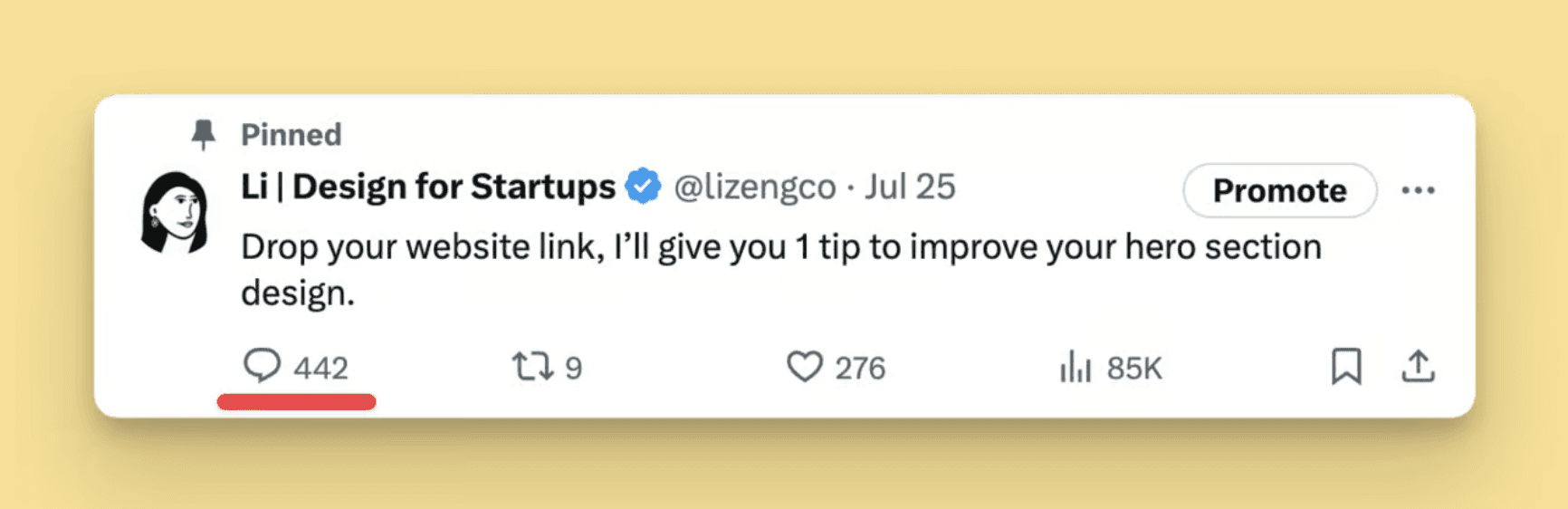
Last week, Li posted a thread to ask founders to drop their website link so she can give them 1 tip to improve their hero section. The response was overwhelming, with over 442 comments pouring in.
While we didn’t count exactly how many websites we reviewed and critiqued, we distilled our observations into the top five pieces of pitfalls based on the most common issues we encountered.
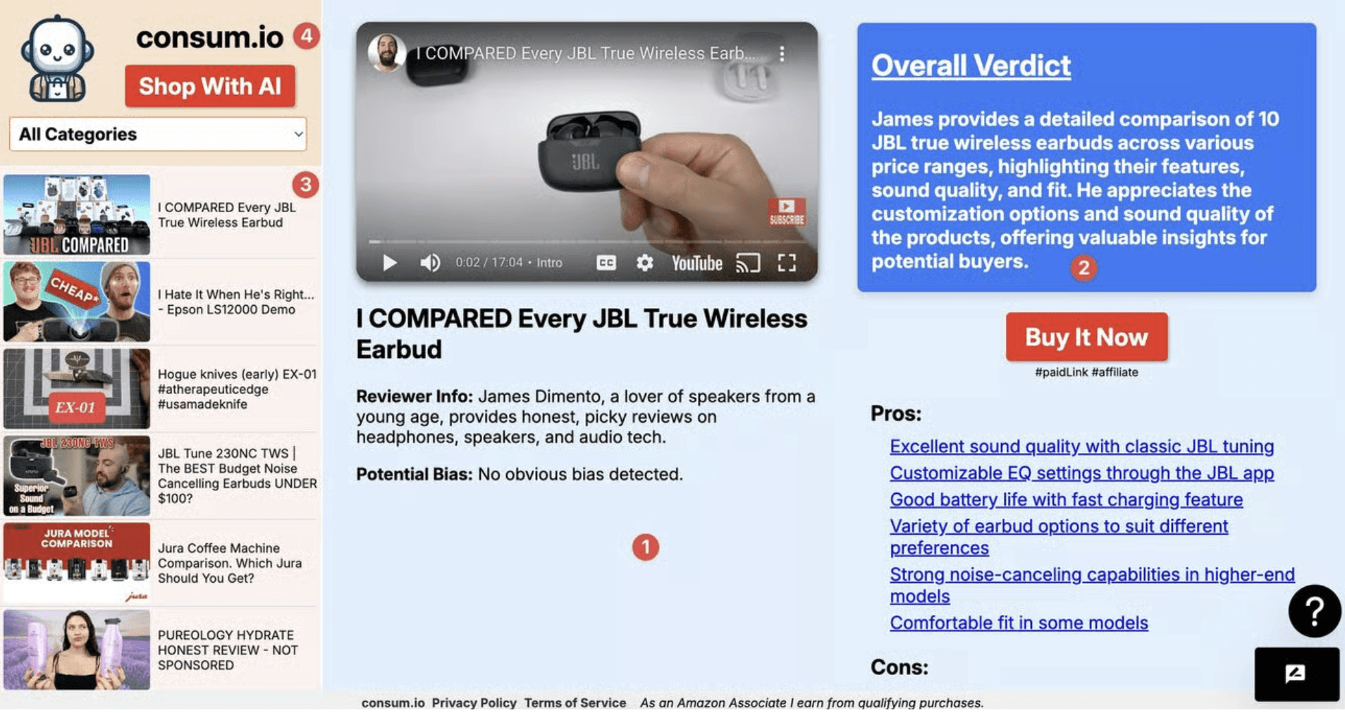
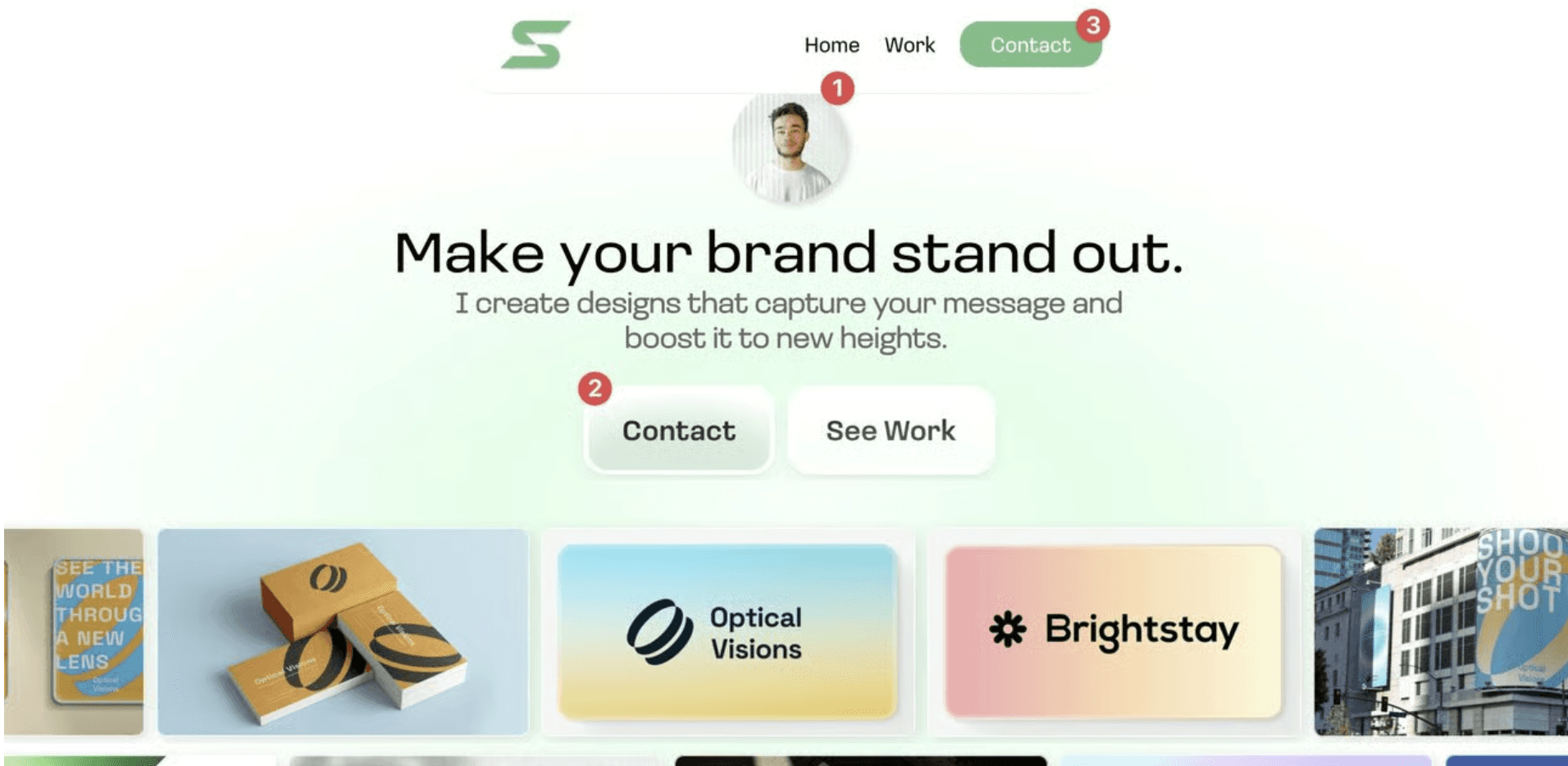
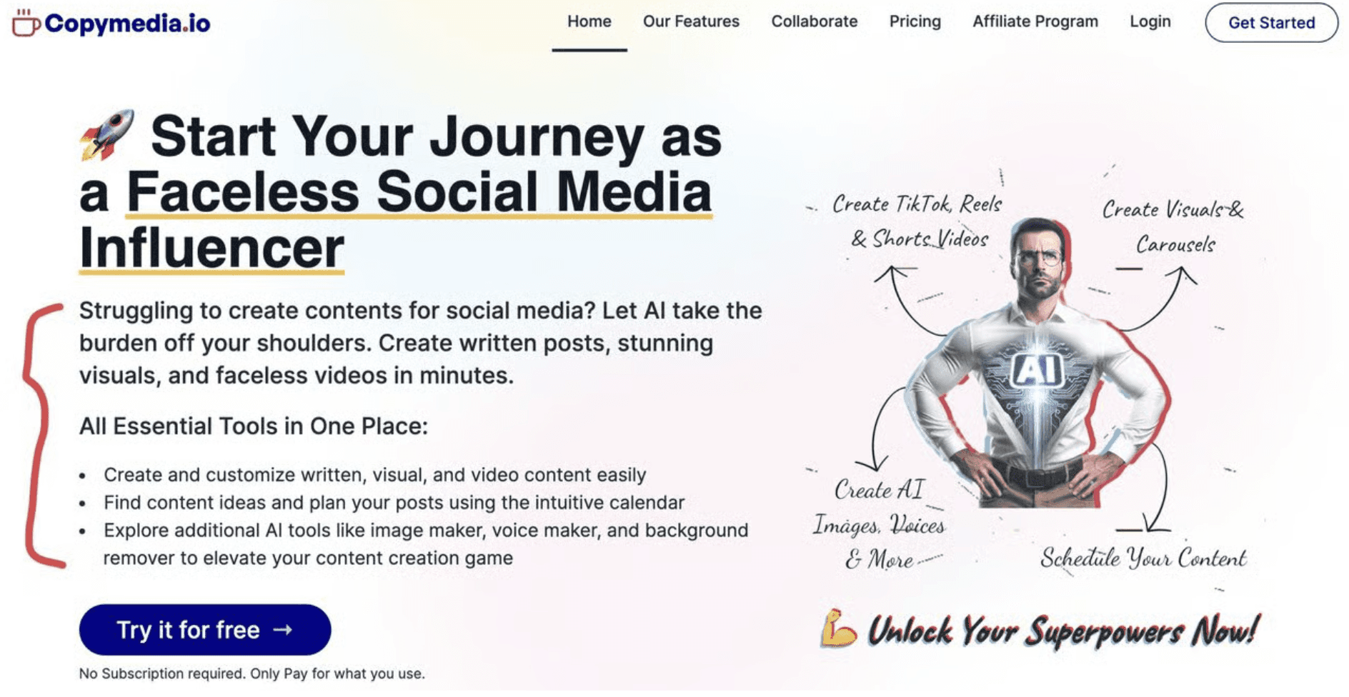
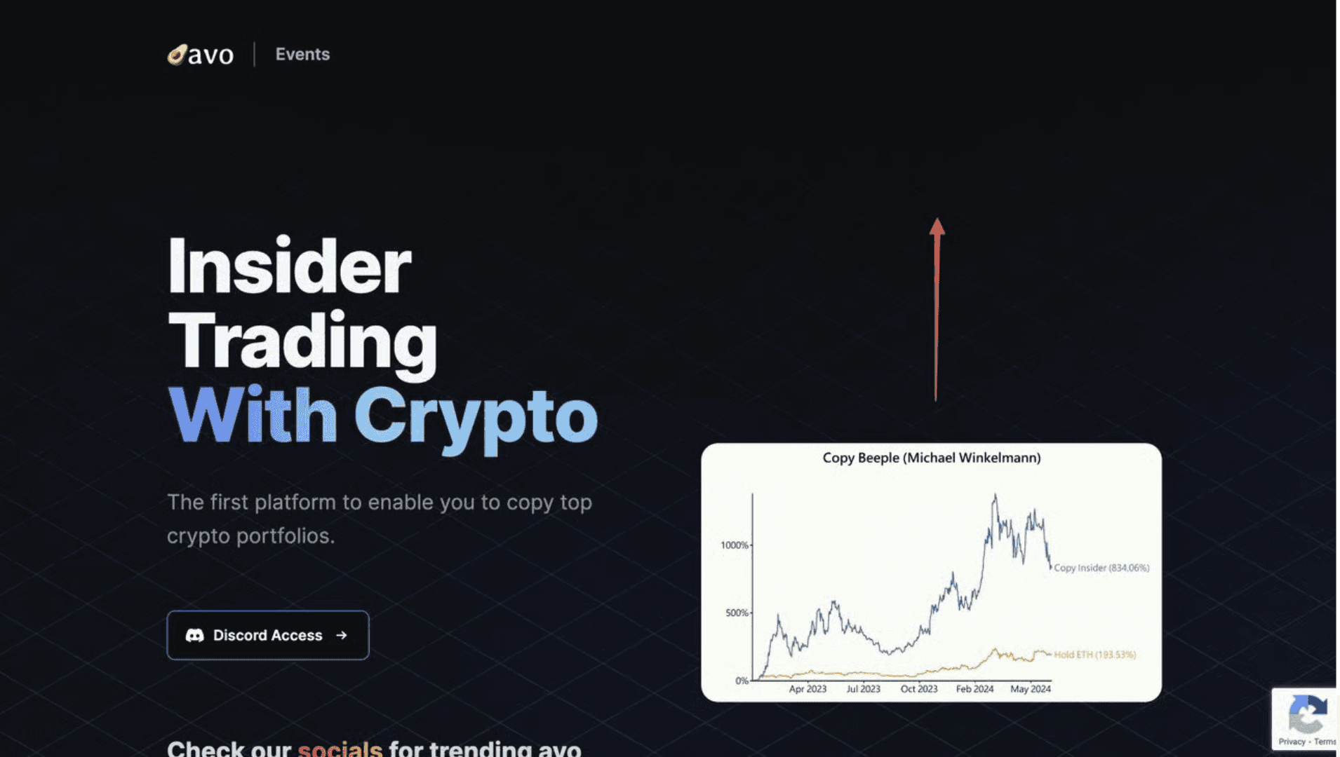
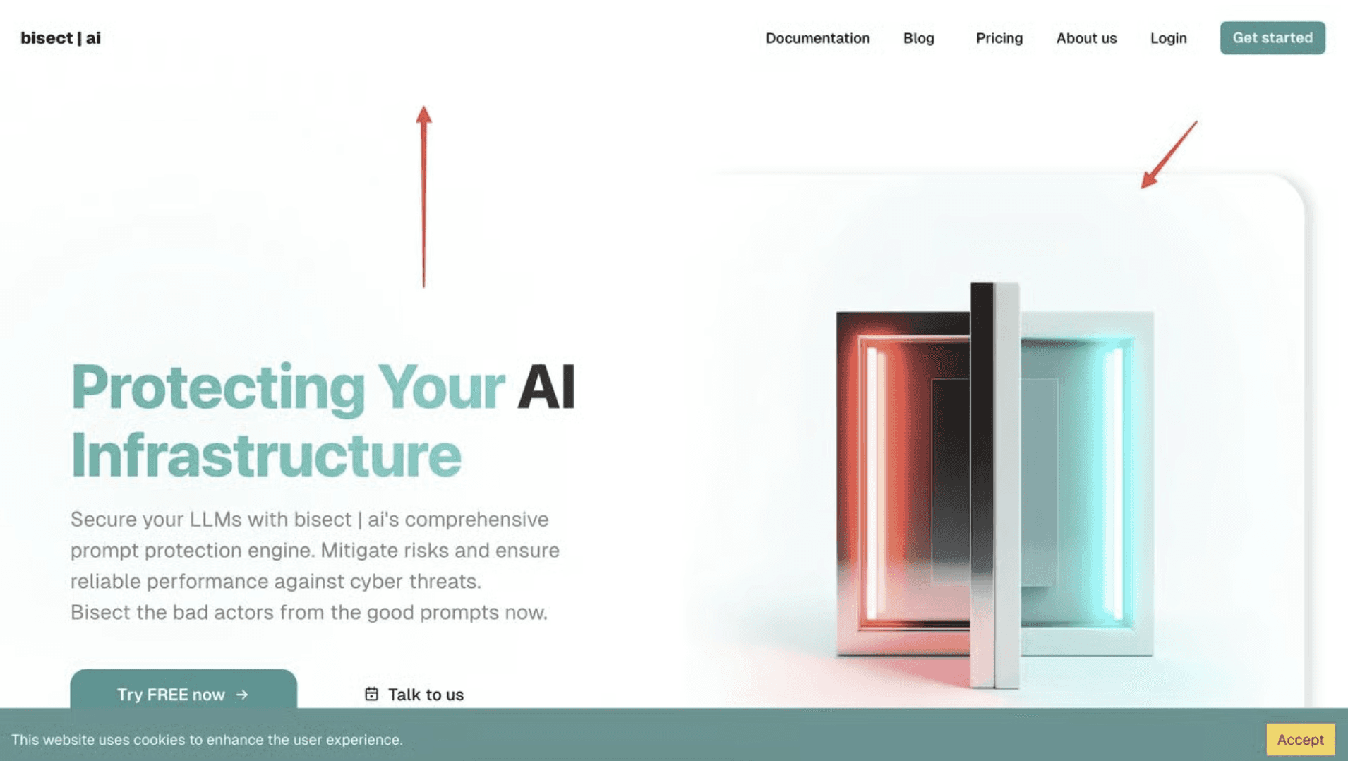
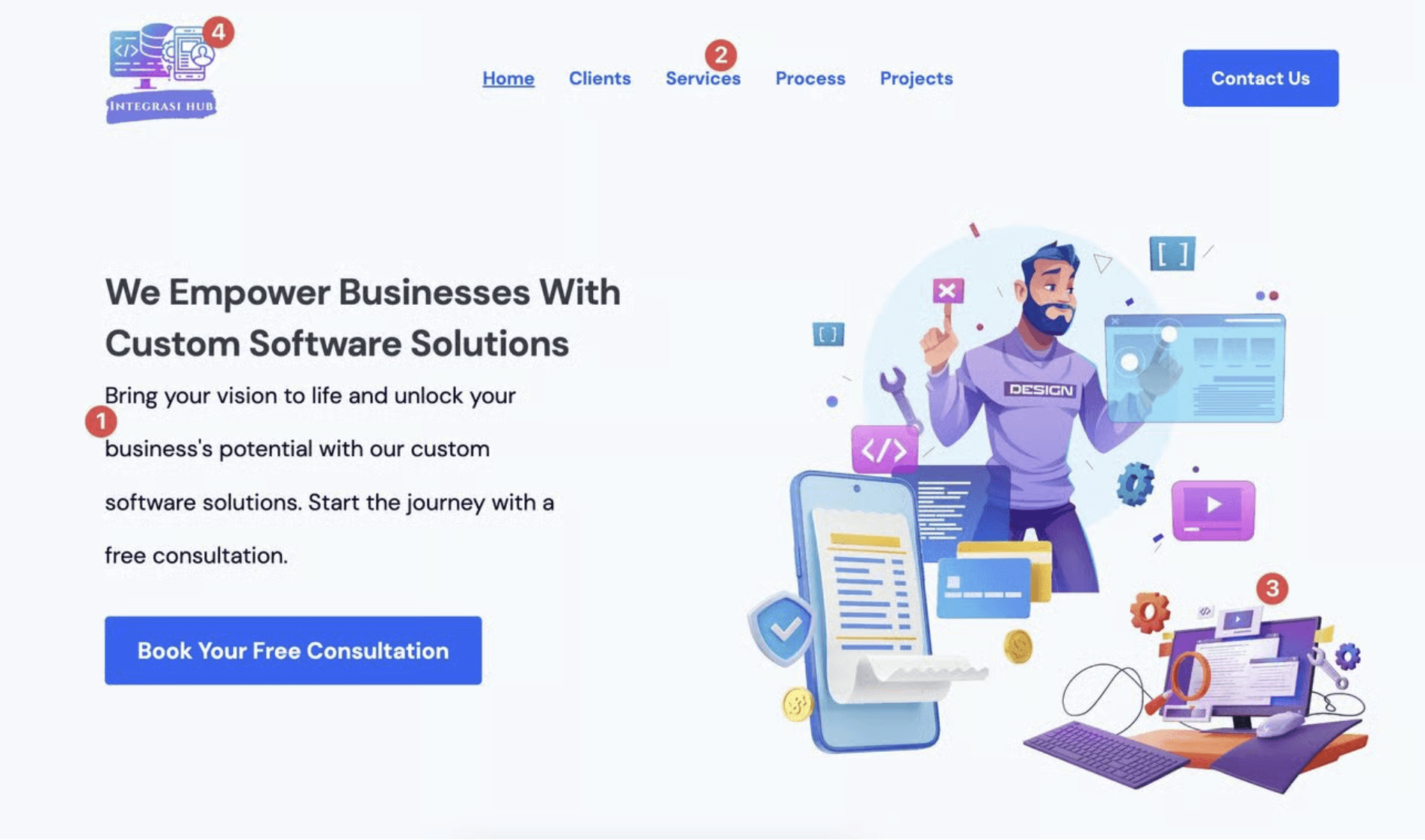
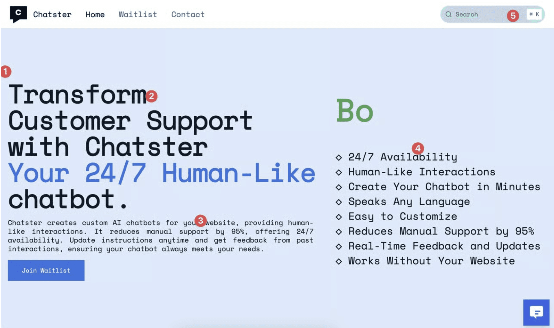
Neglecting to tell a visual story
When a website opens with nothing more than a centered headline floating on a blank background, there’s no cue for the brain to understand context.
Humans process visuals 600x faster than text, and our minds rely heavily on visual cues to decide:
What kind of problem this product solves
Who it’s for
Whether the company feels polished, modern, and trustworthy
When founders skip visual storytelling, two things happen:
The visitor has to “work” to understand you, which increases cognitive load.
The product feels less real, which lowers emotional connection and trust.
A strong visual story reduces mental effort and increases comprehension—not by making things “pretty,” but by helping people form meaning instantly.
Poor color selection and usage
Color is not an aesthetic choice; it’s a psychological signal.
Color influences:
First impression (Is this modern? technical? premium?)
Brand memory (Will they remember this product?)
Perceived difficulty (Does this feel simple or overwhelming?)
Emotional charge (Excitement, calmness, urgency, trust?)
When founders pick one color and apply it everywhere, the brand loses dimension. When they over-decorate with multiple bright colors, the design becomes noisy and confusing.
The result: the visitor subconsciously feels the product is unsophisticated, even if the technology is world-class.
Strategic color systems guide a user through hierarchy, clarity, and emotional flow. Poor color choices break that guidance

Inconsistency in design elements
Inconsistency doesn’t just look messy—it creates micro-dissonance.
Every time a button shape changes or a font weight shifts unexpectedly, the brain catches the discrepancy. It’s subtle, but it triggers this reaction:
“Something feels off… I can’t explain why, but I don’t trust this yet.”
Trust is fragile. And inconsistency erodes it at scale.
When a site is visually aligned, users subconsciously conclude:
This team pays attention to detail
The product is likely high quality
The company is reliable
Consistency equals credibility. Inconsistency equals uncertainty.
Inadequate or too much white space
White space is not empty space. It’s breathing room for the brain.
When elements are too close together, information merges and competes. Visitors feel overwhelmed and bounce—not because your product isn’t good, but because their brain feels tired.
When white space is poorly distributed or excessive, the opposite happens:
The design looks unfinished
Sections feel disconnected
Users lose sense of structure
Optimal white space creates rhythm. It guides the user’s eye through your story with intention. It makes each message land with clarity and confidence.
White space affects reading speed, comprehension, and conversion more than most people realize.
Incorrect font spacing and sizing
Typography is the voice of your brand. Good typography builds trust; bad typography breaks it instantly.
Line spacing, letter spacing, and sizing all impact:
Perceived professionalism
Ease of reading
Emotional tone
Credibility
When spacing is off, visitors may not consciously name the issue—but they feel it. Poor typography creates friction, and friction kills conversions.
Optimized typography lowers cognitive load, improves comprehension, and increases the likelihood that a visitor will actually read your message—and act on it.
By avoiding these five common mistakes, founders can dramatically improve the design and functionality of their websites. Remember, a well-designed website not only looks good but also effectively communicates your message and engages your audience. Happy designing!
Why these mistakes matter far beyond aesthetics
These issues are not “design details.” They tie directly into:
Human impression formation (people decide credibility within 50ms)
Cognitive load (the harder your site is to interpret, the faster people leave)
Emotional trust (clarity and coherence = confidence; noise = doubt)
Business outcomes (conversion, demo requests, signups, investor confidence)
Good design reduces friction, increases clarity, and strengthens the story your startup is trying to tell. Most importantly, it aligns the visitor’s perception with the value you’ve actually built.
A well-designed website isn’t about looking better—it’s about being interpreted correctly.
Sharing a great website
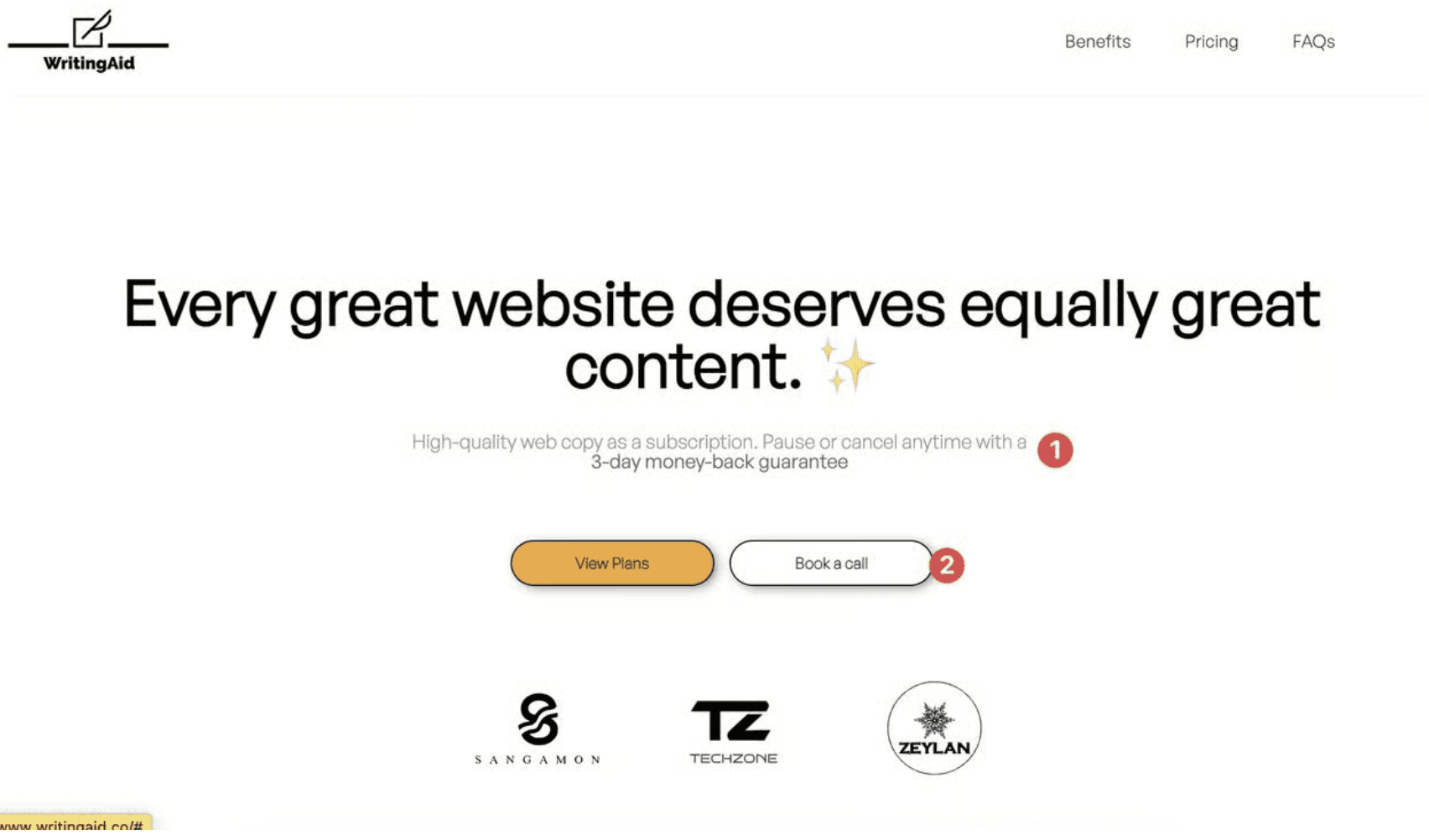
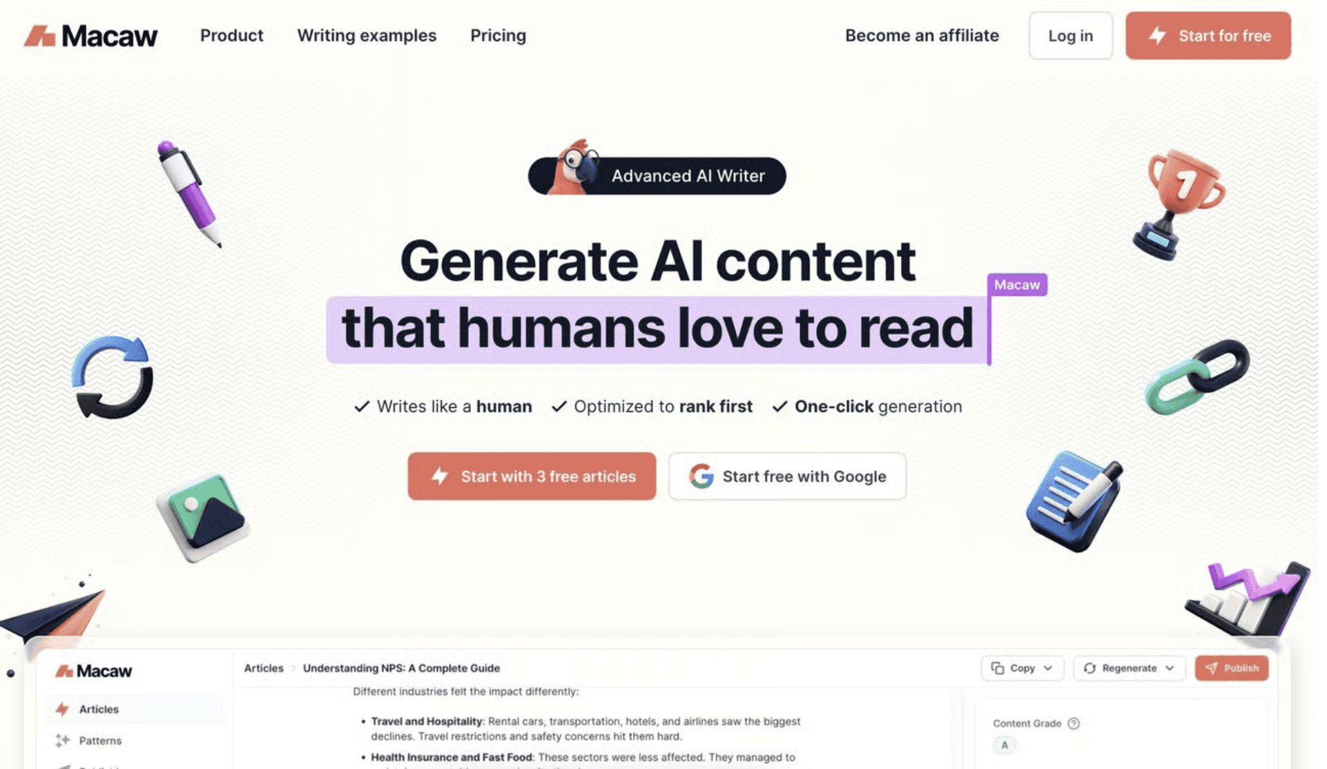
After reviewing hundreds of website, I came across one website called Macaw. My reaction was… no reaction. Meaning: nothing triggered friction.
Here’s what the founder did well:
Clear and consistent brand color
Clean, breathable layout
High readability through thoughtful font choices
Strong contrast and accessibility
Smooth visual narrative that guides the eye effortlessly
Everything works together to communicate:
“This is a modern, thoughtful, high-quality product.”
That is what good design achieves—not beauty for beauty’s sake, but clarity, trust, and momentum.
I hope the above is helpful for those who want to improve their website or learn to better design their website to convert customers better. :)
Key Takeaways
Ignoring clear hierarchy and structure makes websites hard to scan and confuses users.
Overloading pages with text or features dilutes focus and reduces conversion effectiveness.
Failing to design for mobile first leads to poor experiences on the devices most users use.
Skipping visual rhythm and spacing harms readability and perceived quality.
Neglecting performance and loading speeds causes user frustration and loss of conversions.
Let’s work together!
Table of contents
Want a design review like this for your startup?
5 common web design pitfalls founders should avoid
20 min
Studio Salt
After reviewing over 400 startup websites, we have identified several common web design pitfalls that every founder should avoid.
Background Context
Last week, Li posted a thread to ask founders to drop their website link so she can give them 1 tip to improve their hero section. The response was overwhelming, with over 442 comments pouring in.
While we didn’t count exactly how many websites we reviewed and critiqued, we distilled our observations into the top five pieces of pitfalls based on the most common issues we encountered.
Neglecting to tell a visual story
When a website opens with nothing more than a centered headline floating on a blank background, there’s no cue for the brain to understand context.
Humans process visuals 600x faster than text, and our minds rely heavily on visual cues to decide:
What kind of problem this product solves
Who it’s for
Whether the company feels polished, modern, and trustworthy
When founders skip visual storytelling, two things happen:
The visitor has to “work” to understand you, which increases cognitive load.
The product feels less real, which lowers emotional connection and trust.
A strong visual story reduces mental effort and increases comprehension—not by making things “pretty,” but by helping people form meaning instantly.
Poor color selection and usage
Color is not an aesthetic choice; it’s a psychological signal.
Color influences:
First impression (Is this modern? technical? premium?)
Brand memory (Will they remember this product?)
Perceived difficulty (Does this feel simple or overwhelming?)
Emotional charge (Excitement, calmness, urgency, trust?)
When founders pick one color and apply it everywhere, the brand loses dimension. When they over-decorate with multiple bright colors, the design becomes noisy and confusing.
The result: the visitor subconsciously feels the product is unsophisticated, even if the technology is world-class.
Strategic color systems guide a user through hierarchy, clarity, and emotional flow. Poor color choices break that guidance
Inconsistency in design elements
Inconsistency doesn’t just look messy—it creates micro-dissonance.
Every time a button shape changes or a font weight shifts unexpectedly, the brain catches the discrepancy. It’s subtle, but it triggers this reaction:
“Something feels off… I can’t explain why, but I don’t trust this yet.”
Trust is fragile. And inconsistency erodes it at scale.
When a site is visually aligned, users subconsciously conclude:
This team pays attention to detail
The product is likely high quality
The company is reliable
Consistency equals credibility. Inconsistency equals uncertainty.
Inadequate or too much white space
White space is not empty space. It’s breathing room for the brain.
When elements are too close together, information merges and competes. Visitors feel overwhelmed and bounce—not because your product isn’t good, but because their brain feels tired.
When white space is poorly distributed or excessive, the opposite happens:
The design looks unfinished
Sections feel disconnected
Users lose sense of structure
Optimal white space creates rhythm. It guides the user’s eye through your story with intention. It makes each message land with clarity and confidence.
White space affects reading speed, comprehension, and conversion more than most people realize.
Incorrect font spacing and sizing
Typography is the voice of your brand. Good typography builds trust; bad typography breaks it instantly.
Line spacing, letter spacing, and sizing all impact:
Perceived professionalism
Ease of reading
Emotional tone
Credibility
When spacing is off, visitors may not consciously name the issue—but they feel it. Poor typography creates friction, and friction kills conversions.
Optimized typography lowers cognitive load, improves comprehension, and increases the likelihood that a visitor will actually read your message—and act on it.
By avoiding these five common mistakes, founders can dramatically improve the design and functionality of their websites. Remember, a well-designed website not only looks good but also effectively communicates your message and engages your audience. Happy designing!
Why these mistakes matter far beyond aesthetics
These issues are not “design details.” They tie directly into:
Human impression formation (people decide credibility within 50ms)
Cognitive load (the harder your site is to interpret, the faster people leave)
Emotional trust (clarity and coherence = confidence; noise = doubt)
Business outcomes (conversion, demo requests, signups, investor confidence)
Good design reduces friction, increases clarity, and strengthens the story your startup is trying to tell. Most importantly, it aligns the visitor’s perception with the value you’ve actually built.
A well-designed website isn’t about looking better—it’s about being interpreted correctly.
Sharing a great website
After reviewing hundreds of website, I came across one website called Macaw. My reaction was… no reaction. Meaning: nothing triggered friction.
Here’s what the founder did well:
Clear and consistent brand color
Clean, breathable layout
High readability through thoughtful font choices
Strong contrast and accessibility
Smooth visual narrative that guides the eye effortlessly
Everything works together to communicate:
“This is a modern, thoughtful, high-quality product.”
That is what good design achieves—not beauty for beauty’s sake, but clarity, trust, and momentum.
I hope the above is helpful for those who want to improve their website or learn to better design their website to convert customers better. :)
Key Takeaways
Ignoring clear hierarchy and structure makes websites hard to scan and confuses users.
Overloading pages with text or features dilutes focus and reduces conversion effectiveness.
Failing to design for mobile first leads to poor experiences on the devices most users use.
Skipping visual rhythm and spacing harms readability and perceived quality.
Neglecting performance and loading speeds causes user frustration and loss of conversions.
Let’s work together!
Table of contents
5 common web design pitfalls founders should avoid
20 min
Studio Salt
After reviewing over 400 startup websites, we have identified several common web design pitfalls that every founder should avoid.
Background Context
Last week, Li posted a thread to ask founders to drop their website link so she can give them 1 tip to improve their hero section. The response was overwhelming, with over 442 comments pouring in.
While we didn’t count exactly how many websites we reviewed and critiqued, we distilled our observations into the top five pieces of pitfalls based on the most common issues we encountered.
Neglecting to tell a visual story
When a website opens with nothing more than a centered headline floating on a blank background, there’s no cue for the brain to understand context.
Humans process visuals 600x faster than text, and our minds rely heavily on visual cues to decide:
What kind of problem this product solves
Who it’s for
Whether the company feels polished, modern, and trustworthy
When founders skip visual storytelling, two things happen:
The visitor has to “work” to understand you, which increases cognitive load.
The product feels less real, which lowers emotional connection and trust.
A strong visual story reduces mental effort and increases comprehension—not by making things “pretty,” but by helping people form meaning instantly.
Poor color selection and usage
Color is not an aesthetic choice; it’s a psychological signal.
Color influences:
First impression (Is this modern? technical? premium?)
Brand memory (Will they remember this product?)
Perceived difficulty (Does this feel simple or overwhelming?)
Emotional charge (Excitement, calmness, urgency, trust?)
When founders pick one color and apply it everywhere, the brand loses dimension. When they over-decorate with multiple bright colors, the design becomes noisy and confusing.
The result: the visitor subconsciously feels the product is unsophisticated, even if the technology is world-class.
Strategic color systems guide a user through hierarchy, clarity, and emotional flow. Poor color choices break that guidance
Inconsistency in design elements
Inconsistency doesn’t just look messy—it creates micro-dissonance.
Every time a button shape changes or a font weight shifts unexpectedly, the brain catches the discrepancy. It’s subtle, but it triggers this reaction:
“Something feels off… I can’t explain why, but I don’t trust this yet.”
Trust is fragile. And inconsistency erodes it at scale.
When a site is visually aligned, users subconsciously conclude:
This team pays attention to detail
The product is likely high quality
The company is reliable
Consistency equals credibility. Inconsistency equals uncertainty.
Inadequate or too much white space
White space is not empty space. It’s breathing room for the brain.
When elements are too close together, information merges and competes. Visitors feel overwhelmed and bounce—not because your product isn’t good, but because their brain feels tired.
When white space is poorly distributed or excessive, the opposite happens:
The design looks unfinished
Sections feel disconnected
Users lose sense of structure
Optimal white space creates rhythm. It guides the user’s eye through your story with intention. It makes each message land with clarity and confidence.
White space affects reading speed, comprehension, and conversion more than most people realize.
Incorrect font spacing and sizing
Typography is the voice of your brand. Good typography builds trust; bad typography breaks it instantly.
Line spacing, letter spacing, and sizing all impact:
Perceived professionalism
Ease of reading
Emotional tone
Credibility
When spacing is off, visitors may not consciously name the issue—but they feel it. Poor typography creates friction, and friction kills conversions.
Optimized typography lowers cognitive load, improves comprehension, and increases the likelihood that a visitor will actually read your message—and act on it.
By avoiding these five common mistakes, founders can dramatically improve the design and functionality of their websites. Remember, a well-designed website not only looks good but also effectively communicates your message and engages your audience. Happy designing!
Why these mistakes matter far beyond aesthetics
These issues are not “design details.” They tie directly into:
Human impression formation (people decide credibility within 50ms)
Cognitive load (the harder your site is to interpret, the faster people leave)
Emotional trust (clarity and coherence = confidence; noise = doubt)
Business outcomes (conversion, demo requests, signups, investor confidence)
Good design reduces friction, increases clarity, and strengthens the story your startup is trying to tell. Most importantly, it aligns the visitor’s perception with the value you’ve actually built.
A well-designed website isn’t about looking better—it’s about being interpreted correctly.
Sharing a great website
After reviewing hundreds of website, I came across one website called Macaw. My reaction was… no reaction. Meaning: nothing triggered friction.
Here’s what the founder did well:
Clear and consistent brand color
Clean, breathable layout
High readability through thoughtful font choices
Strong contrast and accessibility
Smooth visual narrative that guides the eye effortlessly
Everything works together to communicate:
“This is a modern, thoughtful, high-quality product.”
That is what good design achieves—not beauty for beauty’s sake, but clarity, trust, and momentum.
I hope the above is helpful for those who want to improve their website or learn to better design their website to convert customers better. :)
Key Takeaways
Ignoring clear hierarchy and structure makes websites hard to scan and confuses users.
Overloading pages with text or features dilutes focus and reduces conversion effectiveness.
Failing to design for mobile first leads to poor experiences on the devices most users use.
Skipping visual rhythm and spacing harms readability and perceived quality.
Neglecting performance and loading speeds causes user frustration and loss of conversions.
Want a design review like this for your startup?
Let’s work together!