Table of contents
Want a design review like this for your startup?
Before & After: SpyMetrics Landing Page Redesign
15 min
Studio Salt
We recently redesigned the full landing page for SpyMetrics, not just a component here or a hero swap there — the entire scroll.

The “before” page had strong content, but it made readers do the work: What’s the main promise? Where should I look first? What should I try? Why should I trust this?
The “after” page keeps the same product, but rewrites the page into a guided sequence: promise → try → proof → choose
I like starting full-page redesigns with a minimap because it reveals the real difference: not “new UI,” but a new reading order. When the hierarchy is right, the page becomes easier to understand even as a tiny thumbnail.
Hero
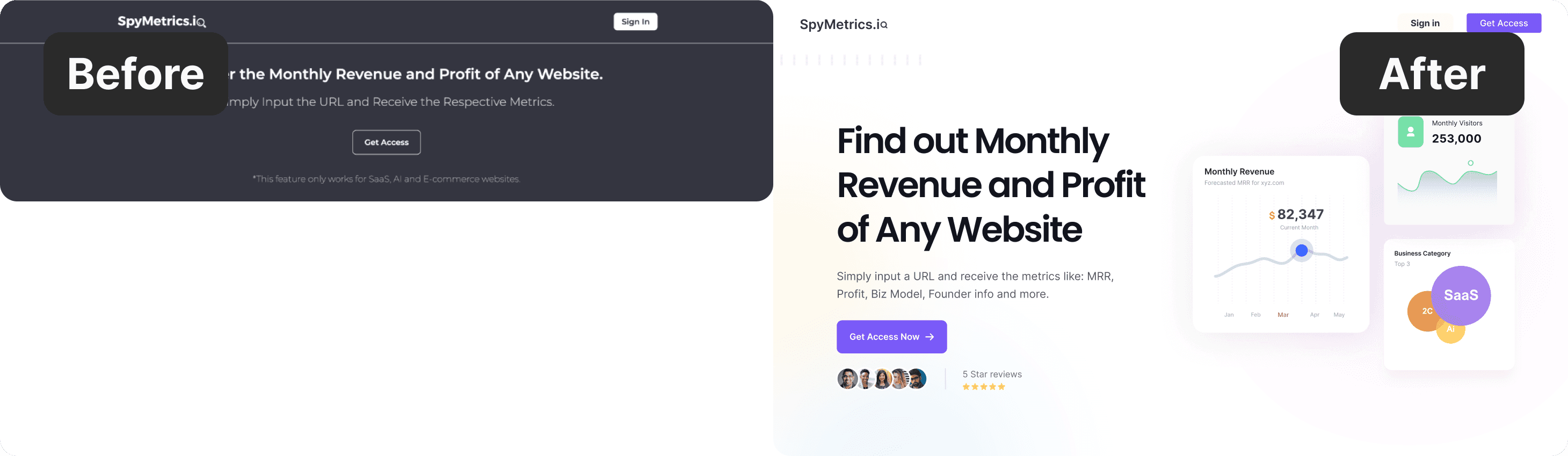
The first screen has one job: help someone understand what this is and what to do next in under three seconds.
In the before version, multiple elements compete for attention. The page is trying to explain and prove at the same time. That creates a subtle hesitation: readers don’t know where to anchor.
In the redesign, the hero becomes more opinionated: a clearer headline, calmer supporting text, and one primary action that feels obviously “next.” The goal isn’t to say more — it’s to make the page decide what it’s selling.
Demo/Search
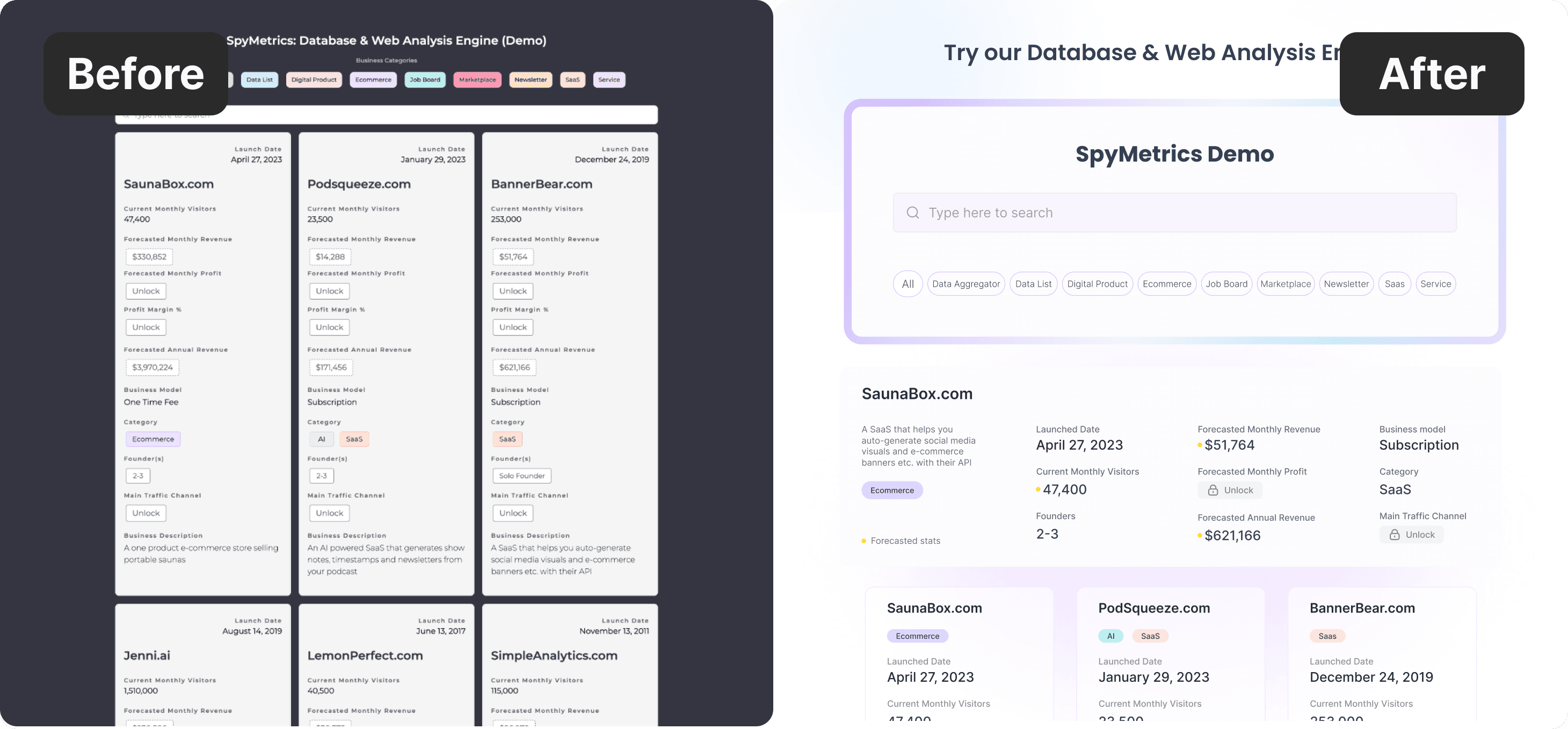
If the product is “type a URL and get metrics,” the page should let readers mentally simulate that action.
The redesign treats the demo like a real entry point, not a decorative section. The field and filters read more clearly, and the whole module feels like: “Try it. You’ll get it instantly.”
This is one of the highest leverage changes on a landing page: turning explanation into interaction.
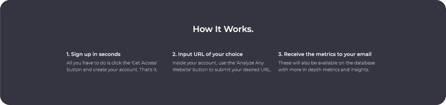
How it works
A “How it works” section isn’t just education. It’s doubt removal.
In the before version, “How it Works” is technically correct, but it reads like a single paragraph spread across three columns. On a quick scroll, it blends into the dark container and doesn’t signal “this is a simple 3-step flow.”
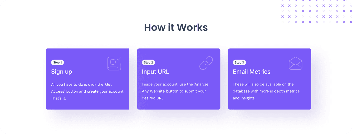
In the after version, the same steps become scan-first cards: each step has a clear title, a visual cue, and enough spacing to read in one glance. It shifts from “explanation” to confidence — you can understand the process without stopping.
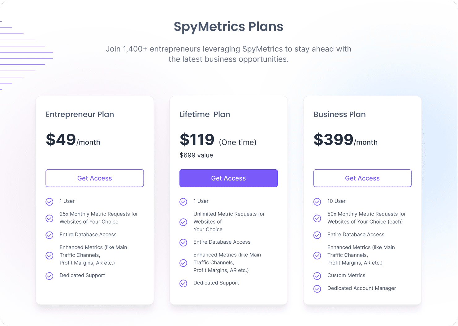
Pricing
Pricing is where pages often lose people — not because the price is wrong, but because the decision feels heavy.
The before layout makes the choice feel heavier: dark background, dense feature lists, and equal visual weight across plans. It reads like a pricing table, not a guided recommendation.
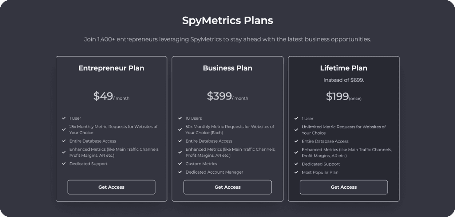
The after layout lowers friction. Cleaner cards, stronger contrast, and a highlighted plan turn pricing into a simple next step. Instead of “three boxes,” it becomes three clear lanes.
The real change
Full-page redesigns aren’t about changing everything. They’re about making the page decide. This one moved from “lots of information” to a clearer sequence:
promise → try → proof → choose
And that’s the point of landing page UX: not to impress — to guide.
Key Takeaways
A landing page needs a plot.
The hero must choose one story.
Turn explanation into interaction.
“How it works” should remove doubt.
Pricing should feel easy, not heavy.
Let’s work together!
Table of contents
Want a design review like this for your startup?
Before & After: SpyMetrics Landing Page Redesign
15 min
Studio Salt
We recently redesigned the full landing page for SpyMetrics, not just a component here or a hero swap there — the entire scroll.
The “before” page had strong content, but it made readers do the work: What’s the main promise? Where should I look first? What should I try? Why should I trust this?
The “after” page keeps the same product, but rewrites the page into a guided sequence: promise → try → proof → choose
I like starting full-page redesigns with a minimap because it reveals the real difference: not “new UI,” but a new reading order. When the hierarchy is right, the page becomes easier to understand even as a tiny thumbnail.
Hero
The first screen has one job: help someone understand what this is and what to do next in under three seconds.
In the before version, multiple elements compete for attention. The page is trying to explain and prove at the same time. That creates a subtle hesitation: readers don’t know where to anchor.
In the redesign, the hero becomes more opinionated: a clearer headline, calmer supporting text, and one primary action that feels obviously “next.” The goal isn’t to say more — it’s to make the page decide what it’s selling.
Demo/Search
If the product is “type a URL and get metrics,” the page should let readers mentally simulate that action.
The redesign treats the demo like a real entry point, not a decorative section. The field and filters read more clearly, and the whole module feels like: “Try it. You’ll get it instantly.”
This is one of the highest leverage changes on a landing page: turning explanation into interaction.
How it works
A “How it works” section isn’t just education. It’s doubt removal.
In the before version, “How it Works” is technically correct, but it reads like a single paragraph spread across three columns. On a quick scroll, it blends into the dark container and doesn’t signal “this is a simple 3-step flow.”
In the after version, the same steps become scan-first cards: each step has a clear title, a visual cue, and enough spacing to read in one glance. It shifts from “explanation” to confidence — you can understand the process without stopping.
Pricing
Pricing is where pages often lose people — not because the price is wrong, but because the decision feels heavy.
The before layout makes the choice feel heavier: dark background, dense feature lists, and equal visual weight across plans. It reads like a pricing table, not a guided recommendation.
The after layout lowers friction. Cleaner cards, stronger contrast, and a highlighted plan turn pricing into a simple next step. Instead of “three boxes,” it becomes three clear lanes.
The real change
Full-page redesigns aren’t about changing everything. They’re about making the page decide. This one moved from “lots of information” to a clearer sequence:
promise → try → proof → choose
And that’s the point of landing page UX: not to impress — to guide.
Key Takeaways
A landing page needs a plot.
The hero must choose one story.
Turn explanation into interaction.
“How it works” should remove doubt.
Pricing should feel easy, not heavy.
Let’s work together!
Table of contents
Before & After: SpyMetrics Landing Page Redesign
15 min
Studio Salt
We recently redesigned the full landing page for SpyMetrics, not just a component here or a hero swap there — the entire scroll.
The “before” page had strong content, but it made readers do the work: What’s the main promise? Where should I look first? What should I try? Why should I trust this?
The “after” page keeps the same product, but rewrites the page into a guided sequence: promise → try → proof → choose
I like starting full-page redesigns with a minimap because it reveals the real difference: not “new UI,” but a new reading order. When the hierarchy is right, the page becomes easier to understand even as a tiny thumbnail.
Hero
The first screen has one job: help someone understand what this is and what to do next in under three seconds.
In the before version, multiple elements compete for attention. The page is trying to explain and prove at the same time. That creates a subtle hesitation: readers don’t know where to anchor.
In the redesign, the hero becomes more opinionated: a clearer headline, calmer supporting text, and one primary action that feels obviously “next.” The goal isn’t to say more — it’s to make the page decide what it’s selling.
Demo/Search
If the product is “type a URL and get metrics,” the page should let readers mentally simulate that action.
The redesign treats the demo like a real entry point, not a decorative section. The field and filters read more clearly, and the whole module feels like: “Try it. You’ll get it instantly.”
This is one of the highest leverage changes on a landing page: turning explanation into interaction.
How it works
A “How it works” section isn’t just education. It’s doubt removal.
In the before version, “How it Works” is technically correct, but it reads like a single paragraph spread across three columns. On a quick scroll, it blends into the dark container and doesn’t signal “this is a simple 3-step flow.”
In the after version, the same steps become scan-first cards: each step has a clear title, a visual cue, and enough spacing to read in one glance. It shifts from “explanation” to confidence — you can understand the process without stopping.
Pricing
Pricing is where pages often lose people — not because the price is wrong, but because the decision feels heavy.
The before layout makes the choice feel heavier: dark background, dense feature lists, and equal visual weight across plans. It reads like a pricing table, not a guided recommendation.
The after layout lowers friction. Cleaner cards, stronger contrast, and a highlighted plan turn pricing into a simple next step. Instead of “three boxes,” it becomes three clear lanes.
The real change
Full-page redesigns aren’t about changing everything. They’re about making the page decide. This one moved from “lots of information” to a clearer sequence:
promise → try → proof → choose
And that’s the point of landing page UX: not to impress — to guide.
Key Takeaways
A landing page needs a plot.
The hero must choose one story.
Turn explanation into interaction.
“How it works” should remove doubt.
Pricing should feel easy, not heavy.
Want a design review like this for your startup?
Let’s work together!