Marketing Design
Rise In
Designing a pioneering brand making blockchain education accessible to all. Learn web3 and build products that benefit the world.

Designing a pioneering brand making blockchain education accessible to all. Learn web3 and build products that benefit the world.

Process
Rise in is a pioneering company that aims to bridge the gap between traditional professionals and the world of web3 technology. They believe in making blockchain education accessible to all and provide online courses and bootcamps that cater to individuals at various levels of expertise. Starting from the fundamentals of blockchain technology, Rise in's comprehensive curriculum guides learners towards advanced topics such as building decentralized applications (Dapps). By offering a supportive community where learners can collaborate and complete projects together, Rise in ensures that individuals gain practical experience and develop the skills needed to thrive in the web3 space.
Upon graduation from Rise in's programs, learners gain access to the prestigious Builder Community. This exclusive community provides job opportunities, grants, and venture building support, enabling individuals to further their careers in web3. Rise in recognizes that the strength of their builder community lies in the diversity of its members, who bring different perspectives and skills to the table. By cultivating a vibrant and inclusive community, Rise in creates an environment where innovation and collaboration flourish.

When Rise in approached our design agency, they shared their ambitious vision of expanding their reach and becoming a global leader in web3 education. Our primary goal was to help them create a recognizable brand that effectively communicated their values and mission. We embarked on an extensive research process to gain insights into Rise in's preferences, including their color choices and desired brand identity.
Our research process began by understanding Rise in's color preferences. They quickly identified bright purple and neon green, which we incorporated into the logo creation process. Using mood boards, we explored various logo directions, including symbols like birds, books, and arrows.

The Rise in team gravitated towards abstract shapes symbolizing community and loved the rising bird concept. We further iterated on abstract shapes, emphasizing togetherness and a sense of pioneering in the Web 3 field. The addition of a star inside the logo represented a "north star" or a brighter future. We also explored flying birds, representing growth and progress.
After narrowing down the options, we experimented with different combinations of shapes and integrated the abstract logo with the bird symbol to showcase community and unity. We also created a simplified version of the logo to demonstrate its effectiveness in small formats, such as website navigation.
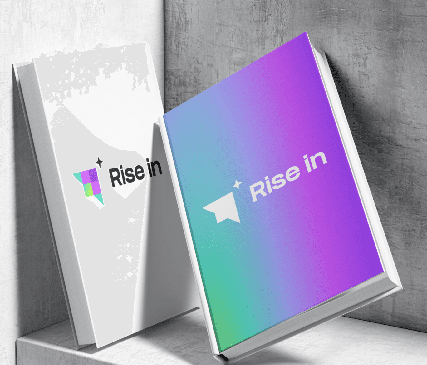
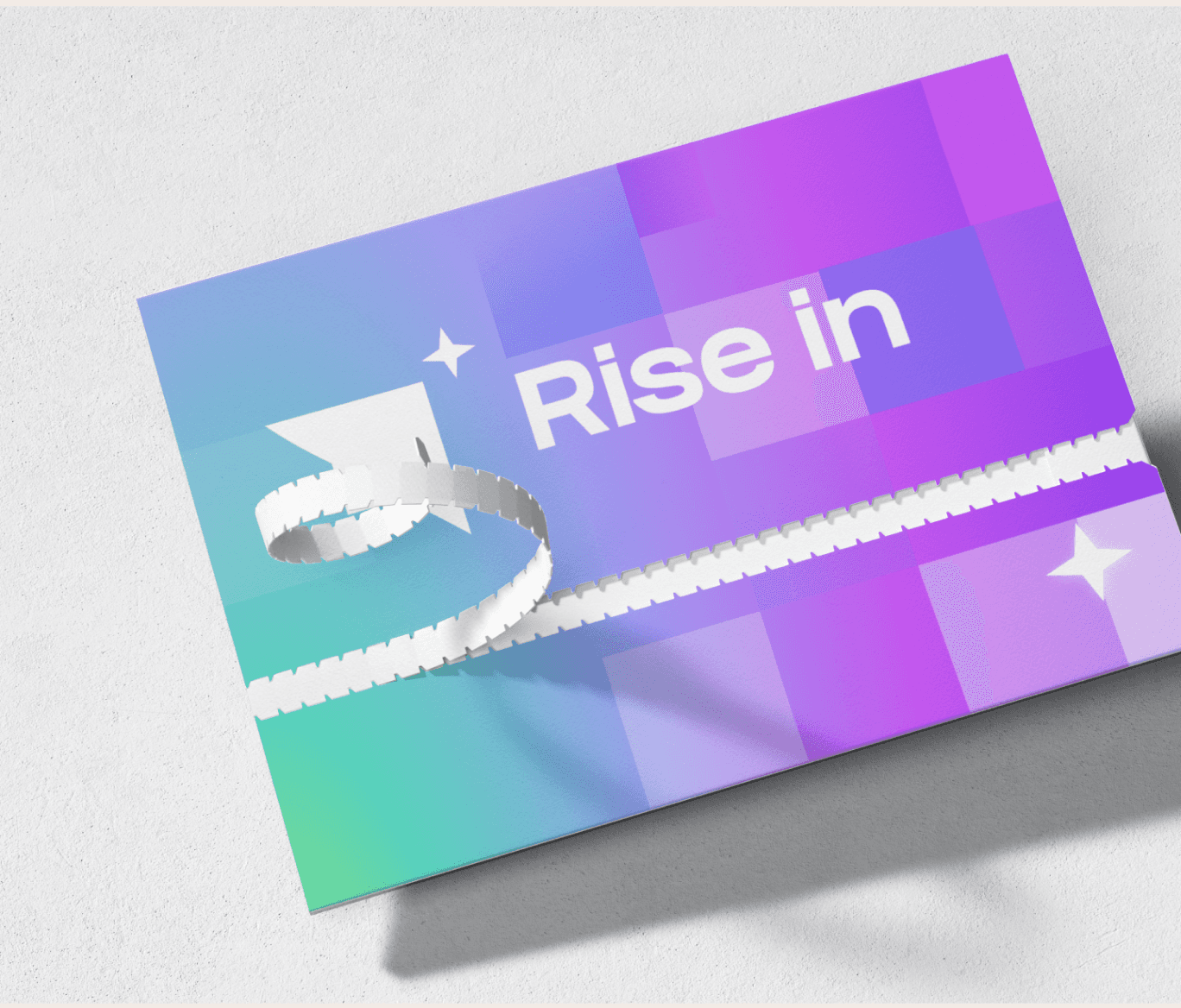
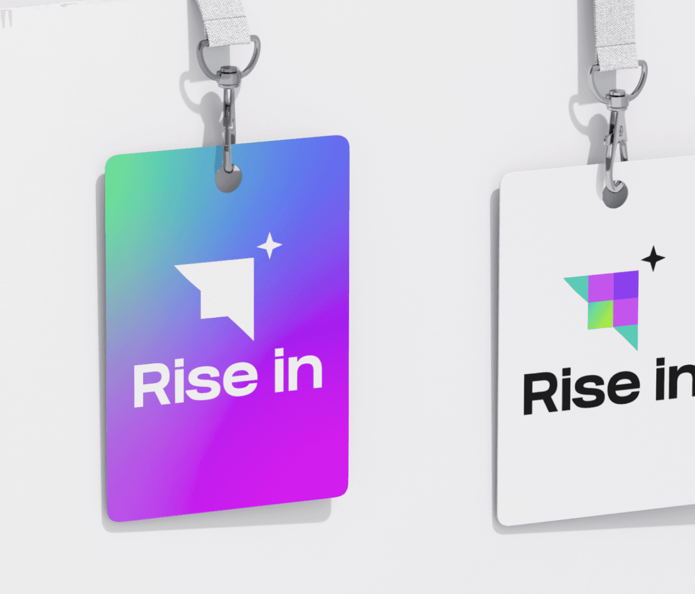
As we refined the logo, we explored color combinations and font options, ultimately finalizing a design that encapsulated Rise in's vision of a supportive community moving towards a brighter future.
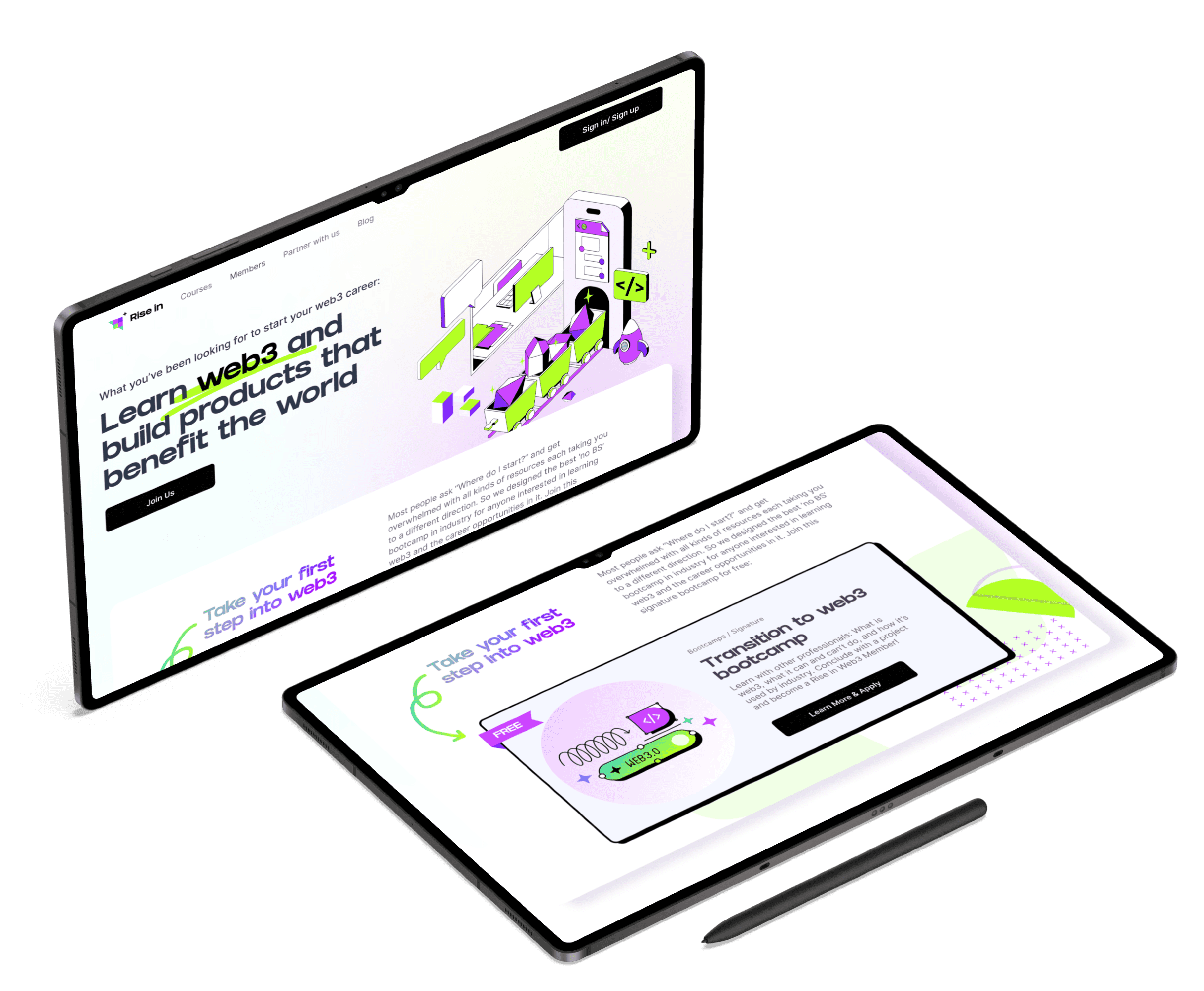
With the logo as the foundation, we embarked on designing the website, ensuring that it reflected Rise in's brand identity and provided an intuitive user experience. We presented different variations of the main landing page, showcasing different styles, and based on Rise in's input, we developed the remaining pages to align with the brand's visual language.

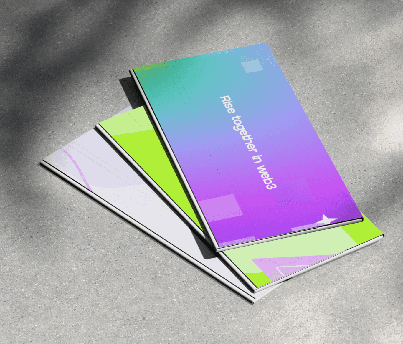
A key aspect of our design process was the exploration of visual elements that would enhance Rise in's brand presence. We developed a package of visual elements, including geometric shapes and vibrant colors, that aligned with Rise in's vision of a fun, fresh, and energetic brand. These visual elements were designed to be versatile, allowing Rise in to use them across various platforms while maintaining a consistent brand identity.
As a result of our month-long collaboration with Rise in, we successfully created a brand that captured the essence of their mission and values. The brand's vibrant and geometric style, coupled with the expressive color palette, positioned Rise in as a dynamic and innovative player in the web3 education space. With a strong brand foundation in place, Rise in is now poised to make a significant impact on a global scale, empowering individuals worldwide to engage with web3 technology and contribute to a brighter future.

Li and Studio Salt gets startups and the founder struggles because they asked good questions about the problem we were attacking and then quickly turned around a design helped us reach our first big enterprise client.
Aaron Ware
@EarnWhere

Li and Studio Salt is awesome to work with and is a top tier design studio. Extremely happy with the work they has produced! You will not be disappointed.
Steve Bauman
@ste_bau

Li and Studio Salt did an amazing job on the UI design for Shipto.me. They were super professional, quick, and really understood exactly what I was looking for. They went above and beyond my expectations—I was so impressed, I hired Studio Salt again for another project!
Alex B
Co-founder of ShipToMe

Working with Studio Salt was a pleasure for us. They really cared about our satisfaction and delivered materials that made our team super happy. I'd work with them again for new projects.
Gülcan Yayla
Co-founder & CEO of Rise In

Studio Salt team exceeded all my expectations. They took my vision and turned it into a beautiful, functional website with flawless execution. As a startup founder, I couldn’t have asked for a better partner to bring my ideas to life.
Peter Heimerdinger
Founder & CEO of Heimify

Highly recommend for reliable, expert designs! Li & team consistently meets deadlines and maintains utmost professionalism in every project. She truly knows what she’s doing.
Alexis Papageorgiou
@papa_gorgeous

Before, our site didn't look professional and had a high bounce rate. Since the redesign we finally started getting Leads via our website. Thank you!
Janu Lingeswaran
Founder of Feather Flow

Studio Salt elevated our brand with a sophisticated new logo and refined newsletter design. Their eye for detail and collaborative approach made the process seamless, delivering outstanding results that transformed our publication's visual identity.
Marketing Brief
@mktbriefing

Studio Salt designer is incredibly talented and creative. I hired them to design the landing page and they delivered outstanding results! They were going above and beyond my expectations. I highly recommend her to anyone in need of design work.
Aditya Saxena
Founder of pmfm.ai

I thoroughly enjoyed working with your team, and will look for what to work together again in the future!
Sanket Patel
Founder of Ingredicheck

Amazing work! I'm working to implement your design...your design is much more clear than where I started!
Michael Breazeale
Founder of Spark Cashflow

Working with Studio Salt has been a pleasure, they are fast and efficient! Li consistently stays ahead of industry trends and provides insightful guidance that elevates the final product.
Zane Greuning
@zanevangreuning

Li and Studio Salt made an awesome design for my landing page and completly overhauled my onboarding. It really drove conversions and kickstarted PhotoQuest! I'm really excited to continue to work with Li and her team.
Thomas Schuehly
@tschuehly

Oh my god! This is so great. I think my eyes just had a micro orgasm. That would be a cool marketing slogan for you :D
Pete
Founder of the SEO Wizard

This is super cool, and super professional. I think you have nailed the brief, in terms of similar to VC sites.
Laurie Owen
@imlaurieowen
Next case study
Let’s work together!


Designing a pioneering brand making blockchain education accessible to all. Learn web3 and build products that benefit the world.

Process
Rise in is a pioneering company that aims to bridge the gap between traditional professionals and the world of web3 technology. They believe in making blockchain education accessible to all and provide online courses and bootcamps that cater to individuals at various levels of expertise. Starting from the fundamentals of blockchain technology, Rise in's comprehensive curriculum guides learners towards advanced topics such as building decentralized applications (Dapps). By offering a supportive community where learners can collaborate and complete projects together, Rise in ensures that individuals gain practical experience and develop the skills needed to thrive in the web3 space.
Upon graduation from Rise in's programs, learners gain access to the prestigious Builder Community. This exclusive community provides job opportunities, grants, and venture building support, enabling individuals to further their careers in web3. Rise in recognizes that the strength of their builder community lies in the diversity of its members, who bring different perspectives and skills to the table. By cultivating a vibrant and inclusive community, Rise in creates an environment where innovation and collaboration flourish.

When Rise in approached our design agency, they shared their ambitious vision of expanding their reach and becoming a global leader in web3 education. Our primary goal was to help them create a recognizable brand that effectively communicated their values and mission. We embarked on an extensive research process to gain insights into Rise in's preferences, including their color choices and desired brand identity.
Our research process began by understanding Rise in's color preferences. They quickly identified bright purple and neon green, which we incorporated into the logo creation process. Using mood boards, we explored various logo directions, including symbols like birds, books, and arrows.

The Rise in team gravitated towards abstract shapes symbolizing community and loved the rising bird concept. We further iterated on abstract shapes, emphasizing togetherness and a sense of pioneering in the Web 3 field. The addition of a star inside the logo represented a "north star" or a brighter future. We also explored flying birds, representing growth and progress.
After narrowing down the options, we experimented with different combinations of shapes and integrated the abstract logo with the bird symbol to showcase community and unity. We also created a simplified version of the logo to demonstrate its effectiveness in small formats, such as website navigation.


As we refined the logo, we explored color combinations and font options, ultimately finalizing a design that encapsulated Rise in's vision of a supportive community moving towards a brighter future.
With the logo as the foundation, we embarked on designing the website, ensuring that it reflected Rise in's brand identity and provided an intuitive user experience. We presented different variations of the main landing page, showcasing different styles, and based on Rise in's input, we developed the remaining pages to align with the brand's visual language.

A key aspect of our design process was the exploration of visual elements that would enhance Rise in's brand presence. We developed a package of visual elements, including geometric shapes and vibrant colors, that aligned with Rise in's vision of a fun, fresh, and energetic brand. These visual elements were designed to be versatile, allowing Rise in to use them across various platforms while maintaining a consistent brand identity.
As a result of our month-long collaboration with Rise in, we successfully created a brand that captured the essence of their mission and values. The brand's vibrant and geometric style, coupled with the expressive color palette, positioned Rise in as a dynamic and innovative player in the web3 education space. With a strong brand foundation in place, Rise in is now poised to make a significant impact on a global scale, empowering individuals worldwide to engage with web3 technology and contribute to a brighter future.

Li and Studio Salt gets startups and the founder struggles because they asked good questions about the problem we were attacking and then quickly turned around a design helped us reach our first big enterprise client.
Aaron Ware
@EarnWhere

Li and Studio Salt is awesome to work with and is a top tier design studio. Extremely happy with the work they has produced! You will not be disappointed.
Steve Bauman
@ste_bau

Li and Studio Salt did an amazing job on the UI design for Shipto.me. They were super professional, quick, and really understood exactly what I was looking for. They went above and beyond my expectations—I was so impressed, I hired Studio Salt again for another project!
Alex B
Co-founder of ShipToMe

Working with Studio Salt was a pleasure for us. They really cared about our satisfaction and delivered materials that made our team super happy. I'd work with them again for new projects.
Gülcan Yayla
Co-founder & CEO of Rise In

Studio Salt team exceeded all my expectations. They took my vision and turned it into a beautiful, functional website with flawless execution. As a startup founder, I couldn’t have asked for a better partner to bring my ideas to life.
Peter Heimerdinger
Founder & CEO of Heimify

Highly recommend for reliable, expert designs! Li & team consistently meets deadlines and maintains utmost professionalism in every project. She truly knows what she’s doing.
Alexis Papageorgiou
@papa_gorgeous

Before, our site didn't look professional and had a high bounce rate. Since the redesign we finally started getting Leads via our website. Thank you!
Janu Lingeswaran
Founder of Feather Flow

Studio Salt elevated our brand with a sophisticated new logo and refined newsletter design. Their eye for detail and collaborative approach made the process seamless, delivering outstanding results that transformed our publication's visual identity.
Marketing Brief
@mktbriefing

Studio Salt designer is incredibly talented and creative. I hired them to design the landing page and they delivered outstanding results! They were going above and beyond my expectations. I highly recommend her to anyone in need of design work.
Aditya Saxena
Founder of pmfm.ai

I thoroughly enjoyed working with your team, and will look for what to work together again in the future!
Sanket Patel
Founder of Ingredicheck

Amazing work! I'm working to implement your design...your design is much more clear than where I started!
Michael Breazeale
Founder of Spark Cashflow

Working with Studio Salt has been a pleasure, they are fast and efficient! Li consistently stays ahead of industry trends and provides insightful guidance that elevates the final product.
Zane Greuning
@zanevangreuning

Li and Studio Salt made an awesome design for my landing page and completly overhauled my onboarding. It really drove conversions and kickstarted PhotoQuest! I'm really excited to continue to work with Li and her team.
Thomas Schuehly
@tschuehly

Oh my god! This is so great. I think my eyes just had a micro orgasm. That would be a cool marketing slogan for you :D
Pete
Founder of the SEO Wizard

This is super cool, and super professional. I think you have nailed the brief, in terms of similar to VC sites.
Laurie Owen
@imlaurieowen
Next case study
Let’s work together!

Designing a pioneering brand making blockchain education accessible to all. Learn web3 and build products that benefit the world.

Process
Rise in is a pioneering company that aims to bridge the gap between traditional professionals and the world of web3 technology. They believe in making blockchain education accessible to all and provide online courses and bootcamps that cater to individuals at various levels of expertise. Starting from the fundamentals of blockchain technology, Rise in's comprehensive curriculum guides learners towards advanced topics such as building decentralized applications (Dapps). By offering a supportive community where learners can collaborate and complete projects together, Rise in ensures that individuals gain practical experience and develop the skills needed to thrive in the web3 space.
Upon graduation from Rise in's programs, learners gain access to the prestigious Builder Community. This exclusive community provides job opportunities, grants, and venture building support, enabling individuals to further their careers in web3. Rise in recognizes that the strength of their builder community lies in the diversity of its members, who bring different perspectives and skills to the table. By cultivating a vibrant and inclusive community, Rise in creates an environment where innovation and collaboration flourish.

When Rise in approached our design agency, they shared their ambitious vision of expanding their reach and becoming a global leader in web3 education. Our primary goal was to help them create a recognizable brand that effectively communicated their values and mission. We embarked on an extensive research process to gain insights into Rise in's preferences, including their color choices and desired brand identity.
Our research process began by understanding Rise in's color preferences. They quickly identified bright purple and neon green, which we incorporated into the logo creation process. Using mood boards, we explored various logo directions, including symbols like birds, books, and arrows.

The Rise in team gravitated towards abstract shapes symbolizing community and loved the rising bird concept. We further iterated on abstract shapes, emphasizing togetherness and a sense of pioneering in the Web 3 field. The addition of a star inside the logo represented a "north star" or a brighter future. We also explored flying birds, representing growth and progress.
After narrowing down the options, we experimented with different combinations of shapes and integrated the abstract logo with the bird symbol to showcase community and unity. We also created a simplified version of the logo to demonstrate its effectiveness in small formats, such as website navigation.


As we refined the logo, we explored color combinations and font options, ultimately finalizing a design that encapsulated Rise in's vision of a supportive community moving towards a brighter future.
With the logo as the foundation, we embarked on designing the website, ensuring that it reflected Rise in's brand identity and provided an intuitive user experience. We presented different variations of the main landing page, showcasing different styles, and based on Rise in's input, we developed the remaining pages to align with the brand's visual language.

A key aspect of our design process was the exploration of visual elements that would enhance Rise in's brand presence. We developed a package of visual elements, including geometric shapes and vibrant colors, that aligned with Rise in's vision of a fun, fresh, and energetic brand. These visual elements were designed to be versatile, allowing Rise in to use them across various platforms while maintaining a consistent brand identity.
As a result of our month-long collaboration with Rise in, we successfully created a brand that captured the essence of their mission and values. The brand's vibrant and geometric style, coupled with the expressive color palette, positioned Rise in as a dynamic and innovative player in the web3 education space. With a strong brand foundation in place, Rise in is now poised to make a significant impact on a global scale, empowering individuals worldwide to engage with web3 technology and contribute to a brighter future.

Li and Studio Salt gets startups and the founder struggles because they asked good questions about the problem we were attacking and then quickly turned around a design helped us reach our first big enterprise client.
Aaron Ware
@EarnWhere

Li and Studio Salt is awesome to work with and is a top tier design studio. Extremely happy with the work they has produced! You will not be disappointed.
Steve Bauman
@ste_bau

Li and Studio Salt did an amazing job on the UI design for Shipto.me. They were super professional, quick, and really understood exactly what I was looking for. They went above and beyond my expectations—I was so impressed, I hired Studio Salt again for another project!
Alex B
Co-founder of ShipToMe

Working with Studio Salt was a pleasure for us. They really cared about our satisfaction and delivered materials that made our team super happy. I'd work with them again for new projects.
Gülcan Yayla
Co-founder & CEO of Rise In

Studio Salt team exceeded all my expectations. They took my vision and turned it into a beautiful, functional website with flawless execution. As a startup founder, I couldn’t have asked for a better partner to bring my ideas to life.
Peter Heimerdinger
Founder & CEO of Heimify

Highly recommend for reliable, expert designs! Li & team consistently meets deadlines and maintains utmost professionalism in every project. She truly knows what she’s doing.
Alexis Papageorgiou
@papa_gorgeous

Before, our site didn't look professional and had a high bounce rate. Since the redesign we finally started getting Leads via our website. Thank you!
Janu Lingeswaran
Founder of Feather Flow

Studio Salt elevated our brand with a sophisticated new logo and refined newsletter design. Their eye for detail and collaborative approach made the process seamless, delivering outstanding results that transformed our publication's visual identity.
Marketing Brief
@mktbriefing

Studio Salt designer is incredibly talented and creative. I hired them to design the landing page and they delivered outstanding results! They were going above and beyond my expectations. I highly recommend her to anyone in need of design work.
Aditya Saxena
Founder of pmfm.ai

I thoroughly enjoyed working with your team, and will look for what to work together again in the future!
Sanket Patel
Founder of Ingredicheck

Amazing work! I'm working to implement your design...your design is much more clear than where I started!
Michael Breazeale
Founder of Spark Cashflow

Working with Studio Salt has been a pleasure, they are fast and efficient! Li consistently stays ahead of industry trends and provides insightful guidance that elevates the final product.
Zane Greuning
@zanevangreuning

Li and Studio Salt made an awesome design for my landing page and completly overhauled my onboarding. It really drove conversions and kickstarted PhotoQuest! I'm really excited to continue to work with Li and her team.
Thomas Schuehly
@tschuehly

Oh my god! This is so great. I think my eyes just had a micro orgasm. That would be a cool marketing slogan for you :D
Pete
Founder of the SEO Wizard

This is super cool, and super professional. I think you have nailed the brief, in terms of similar to VC sites.
Laurie Owen
@imlaurieowen
Next case study
Let’s work together!
