
Product design
Saige
Saige is an intelligent dating platform built for real daters. It cuts through the noise of traditional swiping apps and delivers meaningful connections by focusing on who truly fits for you. Saige handles matching logic, relevance filtering, and interaction cues—letting users spend less time browsing and more time engaging with potential matches.

Saige is an intelligent dating platform built for real daters. It cuts through the noise of traditional swiping apps and delivers meaningful connections by focusing on who truly fits for you. Saige handles matching logic, relevance filtering, and interaction cues—letting users spend less time browsing and more time engaging with potential matches.
Our Collaboration
As Saige’s branding and product experience partner, we contributed across multiple layers of their launch and growth journey:
Visual identity system (logo, color, typography)
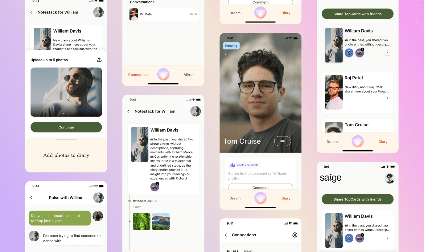
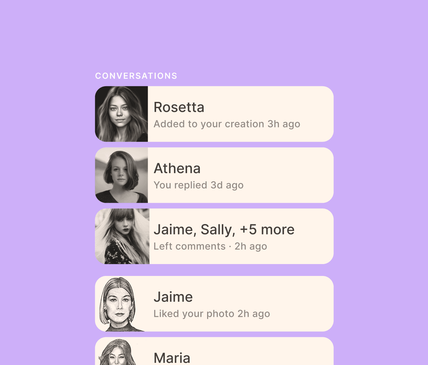
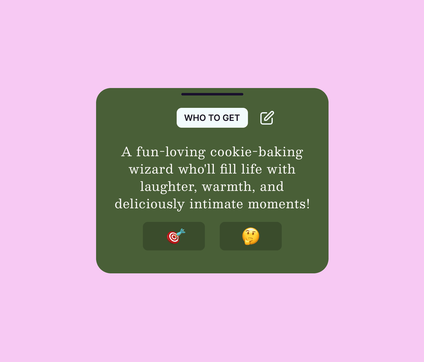
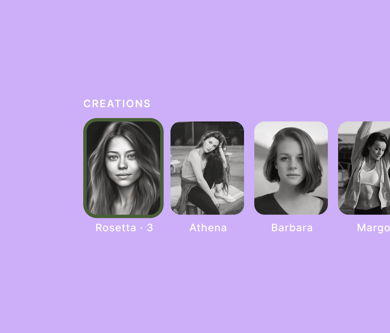
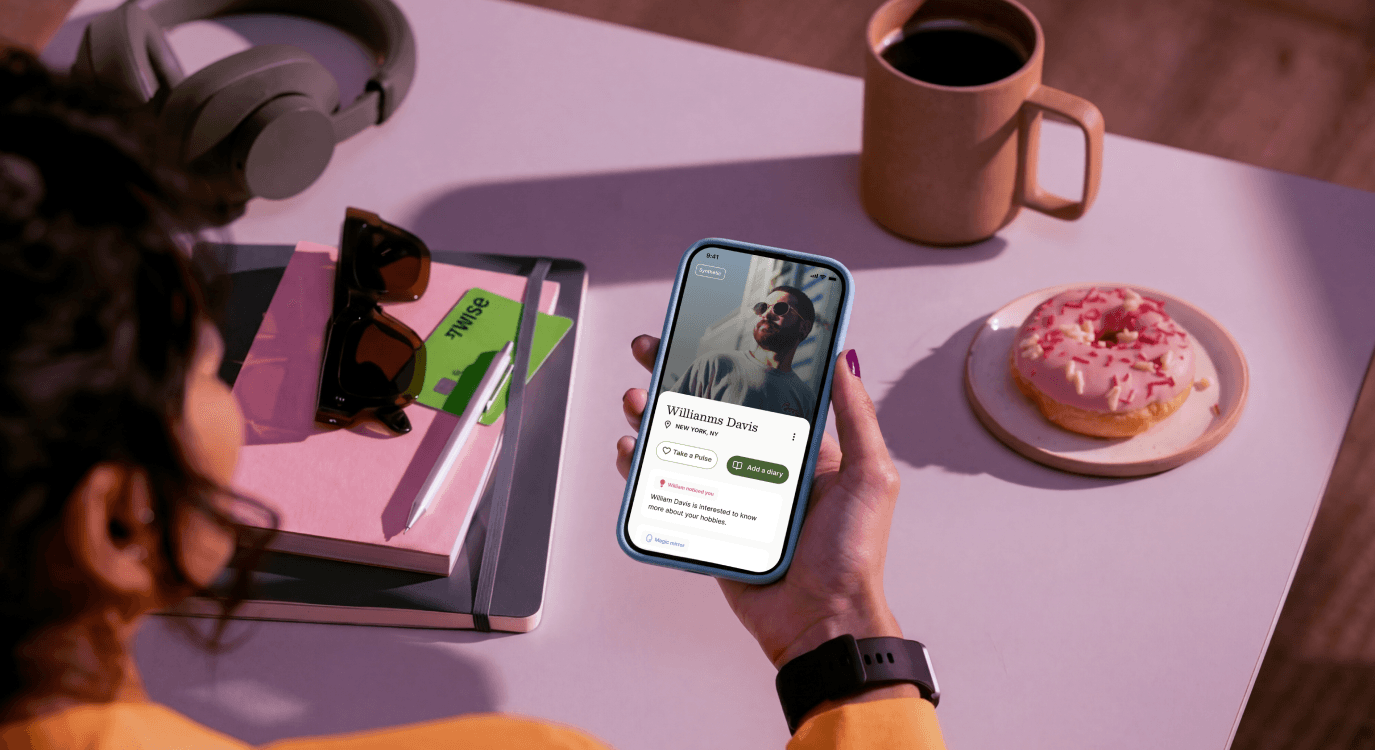
Core app prototypes and user flow design
Illustration and iconography system to unify brand voice
By working closely with the Saige team, we ensured every touchpoint reflected their mission: a modern, heartfelt, and trustworthy space for real connections.
Process
We began by mapping out Saige’s positioning—understanding their audience, tone of voice, and differentiation in a crowded dating app market. From this, we established the guiding principles of warm, modern, sincere, and approachable, which drove every design decision that followed.
The Saige team wanted a brand identity that felt human and trustworthy. We explored visual directions around connection, warmth, and simplicity, from abstract handshakes to heart-like forms. After multiple iterations, we arrived at a minimal yet expressive mark that balanced geometry with friendliness. The logo was paired with a cohesive visual system—including rules for black-and-white use, minimum sizing, and clear space—to ensure scalability across digital and print contexts.
With the logo finalized, we moved to design Saige’s website and landing page. Starting from lo-fi wireframes, we built towards a polished, the final landing page brought together the team’s favorite elements from three proposed directions, creating a unified digital presence that resonated with Saige’s mission.
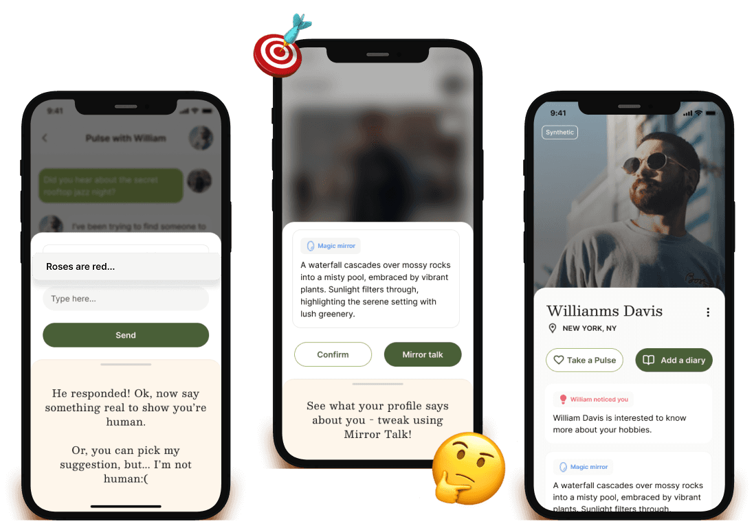
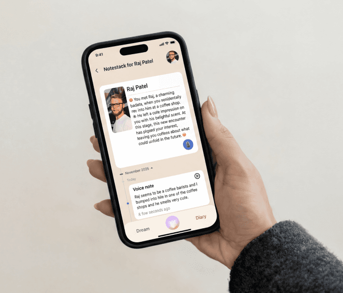
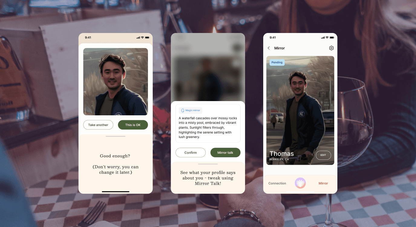
We designed Saige’s core app flows—including profile creation, matching, and messaging—with a focus on clarity and ease. Each screen was simplified to reduce friction, while UI states provided constant feedback so users always knew where they were in the journey. The result was an intuitive experience where users felt supported rather than overwhelmed.

Outcomes
Through our collaboration, we helped Saige build a unified brand presence—from logo to product experience—that amplifies their mission to create a dating platform for people who are serious about genuine connections.
Impact
The success of our collaboration with Saige highlights the importance of bridging strategic branding with thoughtful user experience design. By building consistency across visual identity, product flows, and campaign storytelling, Saige was able to launch not only as another dating app but as a platform that people immediately recognized as different—human, trustworthy, and purposeful.
As Saige continues to grow, their brand foundation and UX strategy will scale with them, enabling the platform to build deeper community trust, foster long-term user retention, and further differentiate itself in a saturated market. Our work together proved that when design is aligned with mission, it can create an emotional bond that drives both adoption and loyalty.


Next case study

Let’s work together!
All rights reserved © Studio Salt 2024